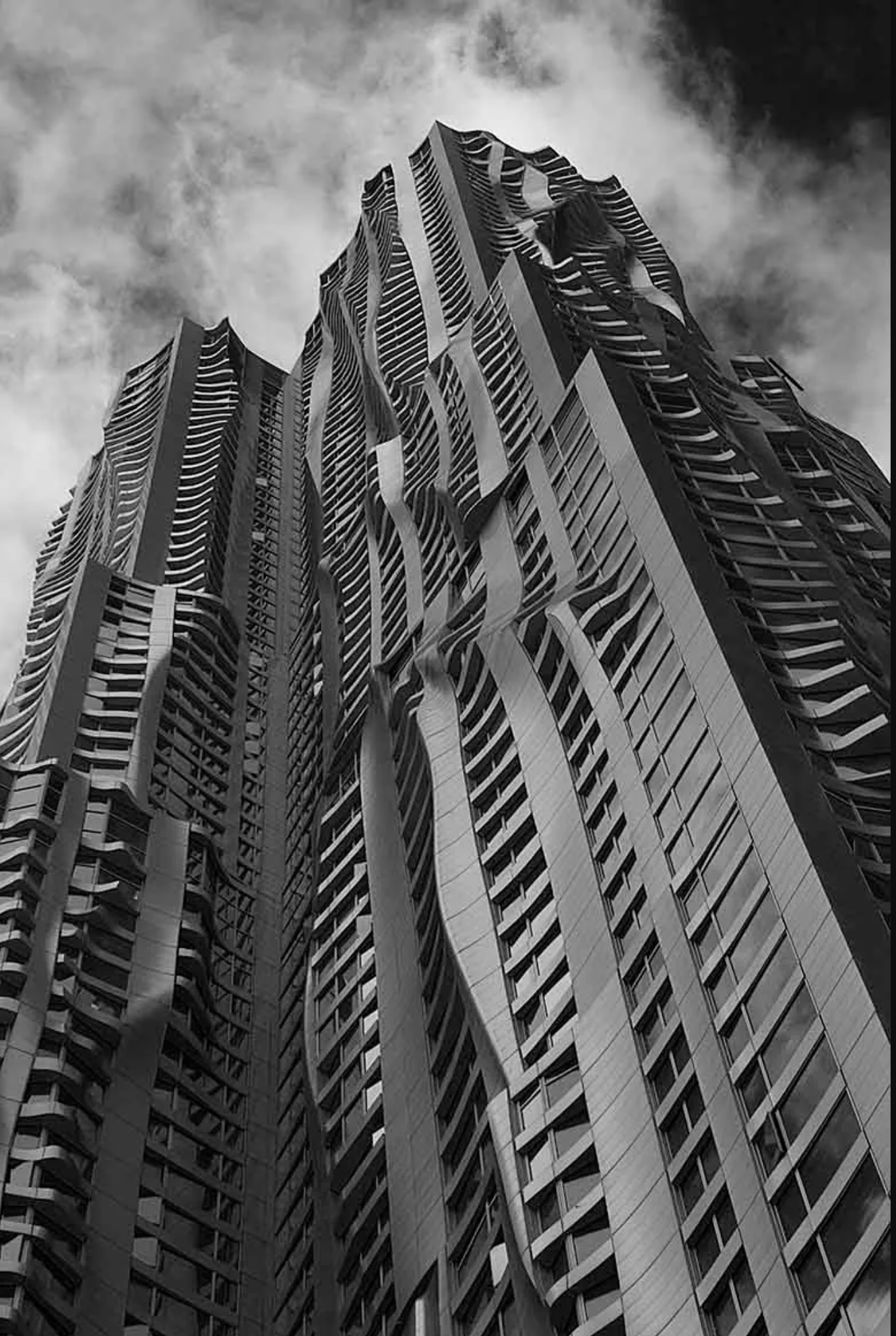
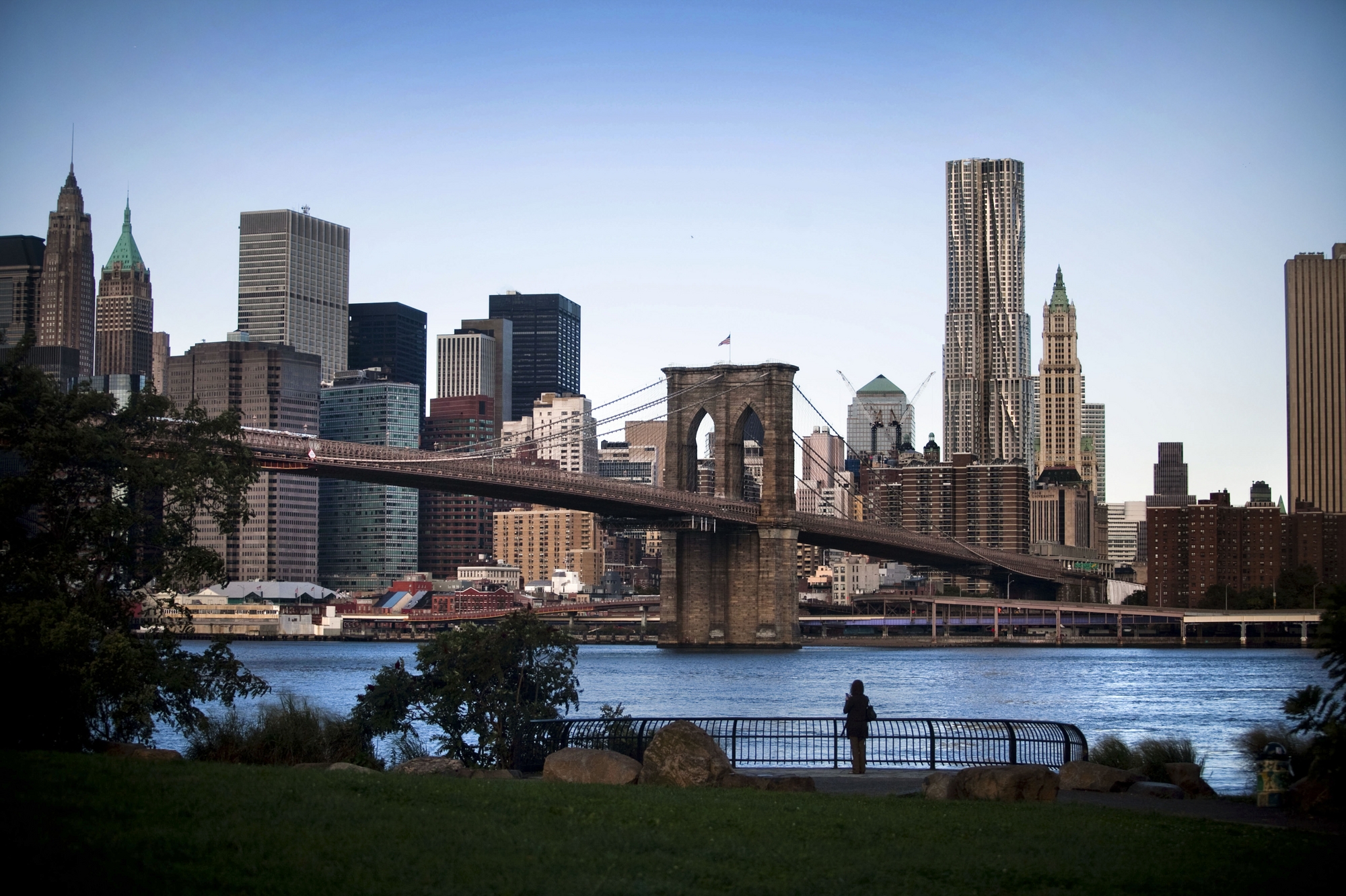
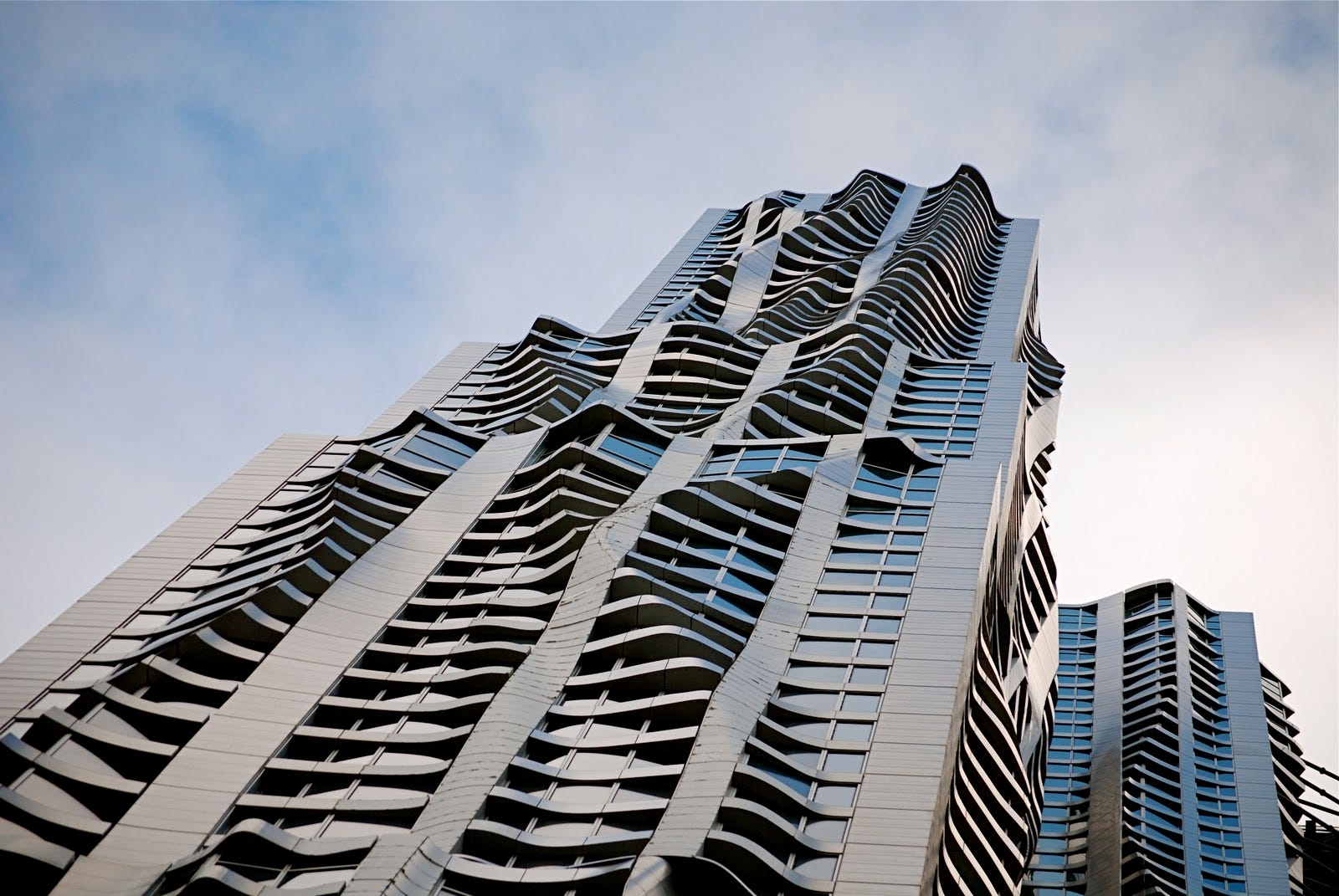
Lower Manhattan in the mid-2000s was still recalibrating. The Financial District had lost its daytime population and had not yet become the neighborhood it is today. The site on Spruce Street, just east of City Hall Park and beside the Woolworth Building, was a parking lot. Forest City Ratner and developer Bruce Ratner commissioned Frank Gehry for what would become his first skyscraper, a 76-story mixed-use tower with 899 apartments, a public school, medical offices, and retail at its base. When it opened in 2011, at 870 feet it was the tallest residential tower in the Western Hemisphere. The New York Times called it the finest skyscraper to rise in New York since Saarinen’s CBS Building.
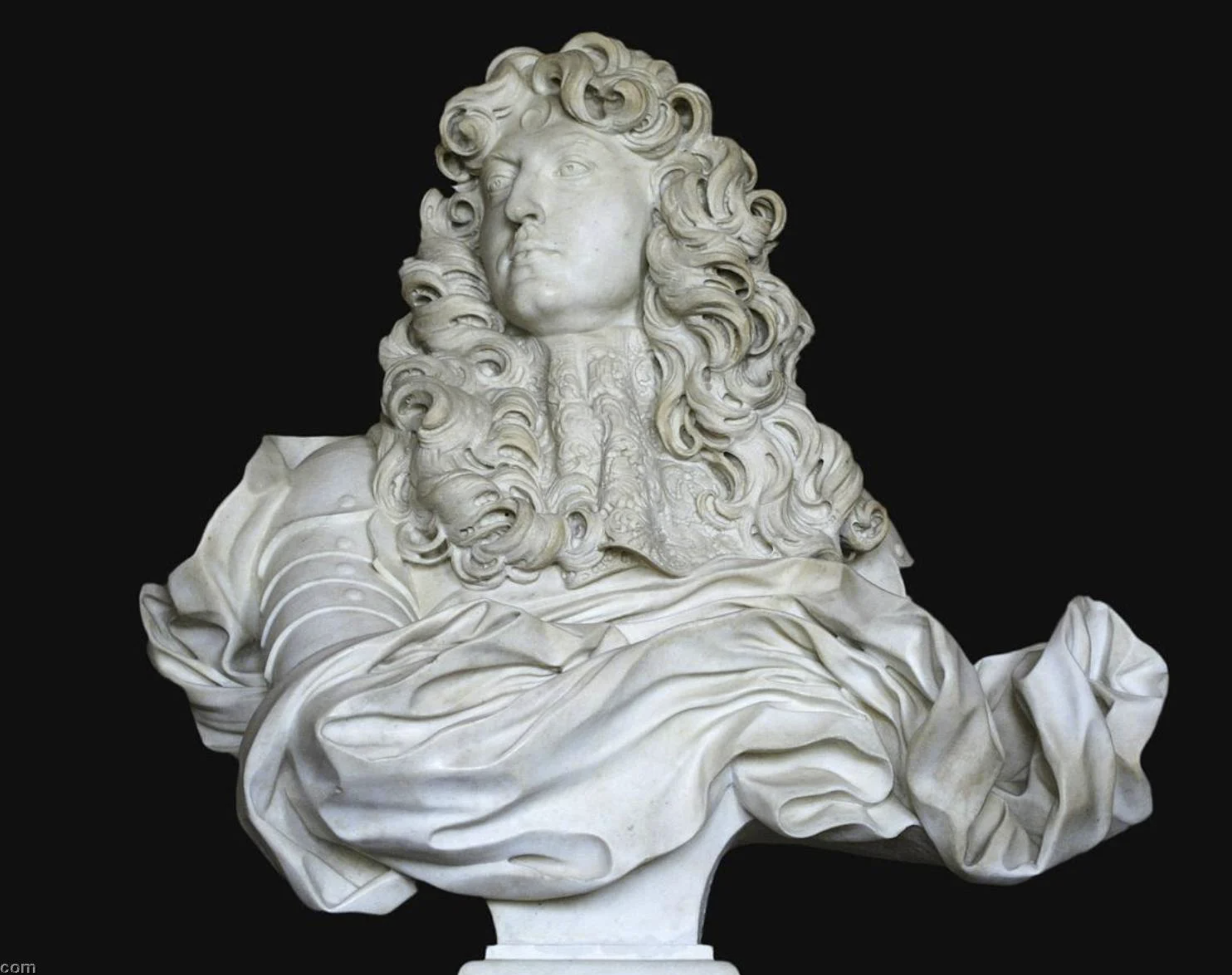
The design direction arrived the way Frank’s directions often did, obliquely. He had just returned from traveling, had been looking at Bernini, and wanted to know if we understood the difference between Bernini folds and Michelangelo folds. Michelangelo’s drapery is structural, heavy, gravitational. Bernini’s is kinetic, light, seemingly in motion. The facade needed to read like the latter. That distinction guided everything that followed.
Translating that direction into a buildable curtain wall meant navigating the facade contractor directly. Those meetings, presenting the geometry, fielding pushback on complexity, were usually just me and the engineers, Frank rarely in the room. The contractor’s position was consistent: too much variation, simplify the design. The response was equally consistent: adjust where necessary, protect the vision everywhere else. There was a moment, mid-negotiation, when Frank walked past the library where one of those sessions was happening. He paused, looked in, asked how it was going. I told him we were going back and forth with the facade contractor about what was buildable. He said, “This is the most important building of my career. Don’t f--- it up.” Then walked away. The engineers fell into alignment shortly after.
Carrying that compositional logic from Frank’s physical models into a buildable tower required technology the architecture industry had not yet widely adopted. CATIA, the aerospace-grade parametric software developed by Dassault Systèmes, was the tool that made it possible. At Gehry Partners, it had been pioneered precisely for this reason: to realize designs that could be conceived by hand but not documented or built without computational precision. That was the philosophy too, the computer as a tool to manifest a vision, not to generate one. The design happened in the model shop. CATIA was how it survived contact with fabricators, structural engineers, and construction. Working in it across three and a half years on this project built a fluency that became the foundation for much of what followed. At ZHA, it remained a specialized tool, respected but not widely adopted. Every building I delivered there was built in it.
MICHAEL SIMS
Founder and Design Director · SimLabs LLC
Practice and Selected Work
Building design, pre-construction, and computational design.
Founder and Design Director, Miami and London. 2024–present.
An independent practice bridging the gaps between owner, architect, and contractor. It is in these spaces that inefficiencies thrive, projects lose money, schedules slip, and design intent is lost.
Over twenty years practicing inside the following studios.
Michael A. Sims Jr., Assoc. AIAAssociate Member, American Institute of Architects · #39177299michaelsimslab.com
OBMI
Architects of storied places.
Associate Design Director, Miami. 2023–2025.
A ninety-year legacy hospitality practice rooted in storytelling, a sense of place, and experiences that ignite the spirit.
Joined to lead the firm’s most ambitious commission, a flagship development that had been seven years in concept design before receiving approval. Delivered it through RIBA Stages 2–4, then took on additional projects across the UAE and Egypt spanning luxury hospitality, branded residences, and retail.
Joined to lead the firm’s most ambitious commission, a flagship development that had been seven years in concept design before receiving approval. Delivered it through RIBA Stages 2–4, then took on additional projects across the UAE and Egypt spanning luxury hospitality, branded residences, and retail.
Project imagery is confidential and available for review in person.
18
GEHRY PARTNERS
Los Angeles, 2003–2008
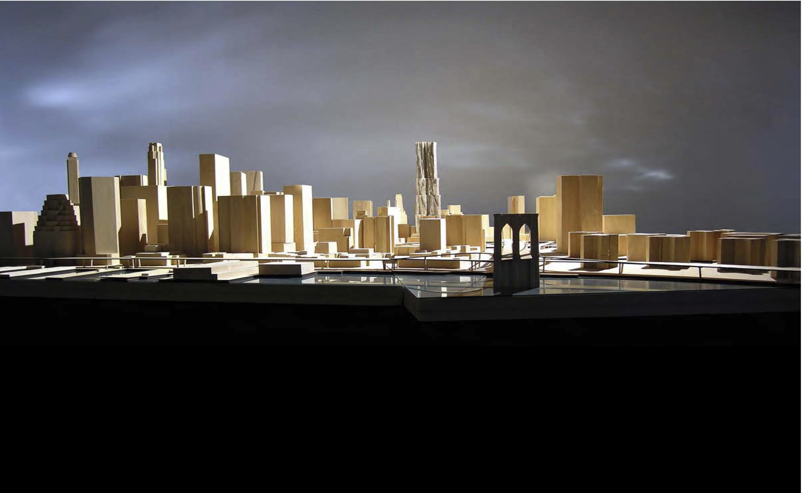
Most people read Frank’s work as sculptural gesture, as surface, without understanding that the process begins somewhere entirely different. What becomes apparent almost immediately inside the office is a process that begins with site, context, and program. Enormous wooden models on custom-built tables are wheeled around the studio, pulled apart, split in section, walked through. Basswood block massing models representing building program stacked and shifted and reconfigured with a playful idiosyncrasy until the relationships between elements produce something unexpected, but right. This is where intuition and pragmatism create a certain tension that must be explored. Only once that challenge of program, site, and context is understood, rigorously tested, and solved does a more fluid gesture arrive, softening the massing that preceded it, following its geometry rather than replacing it. That is what most people misread about his work, and the most important thing I took from it. A small concert hall in Miami and a signature tower that became the most important building of his career became the most significant of mine, shaping my professional journey through nearly every office that followed.
GEHRY PARTNERS
New York By Gehry
(8 Spruce Street)
(8 Spruce Street)
04
GEHRY PARTNERS
New World Symphony
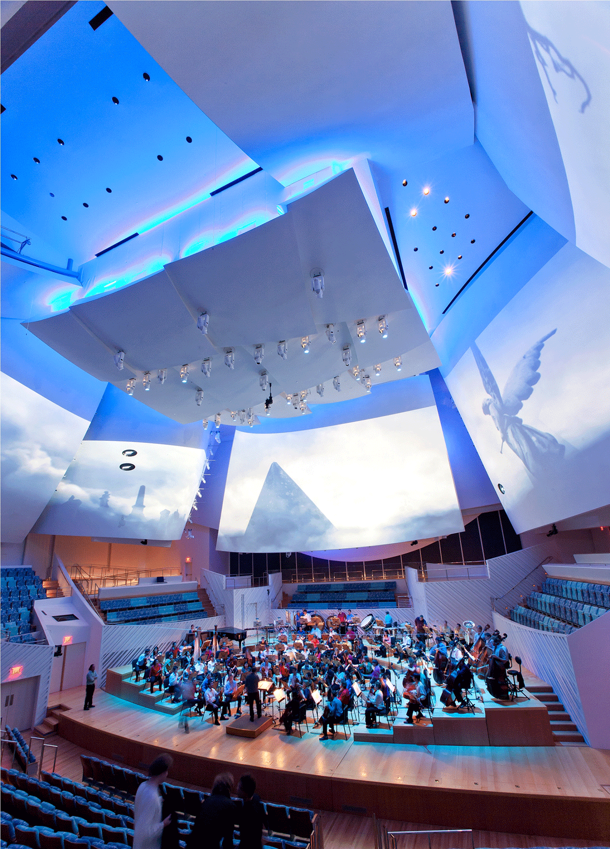
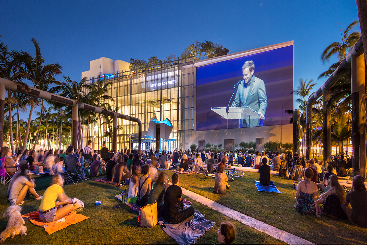
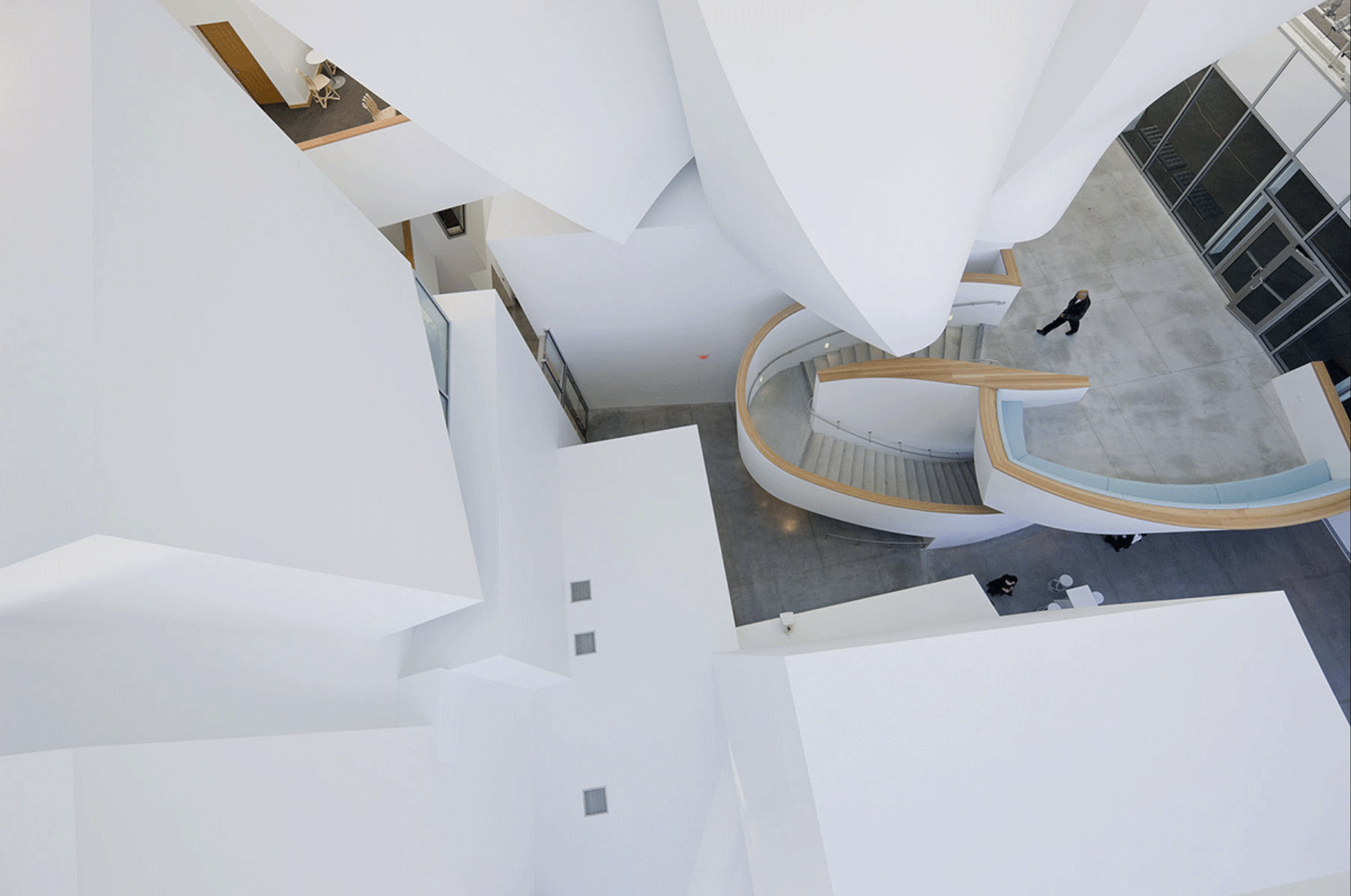
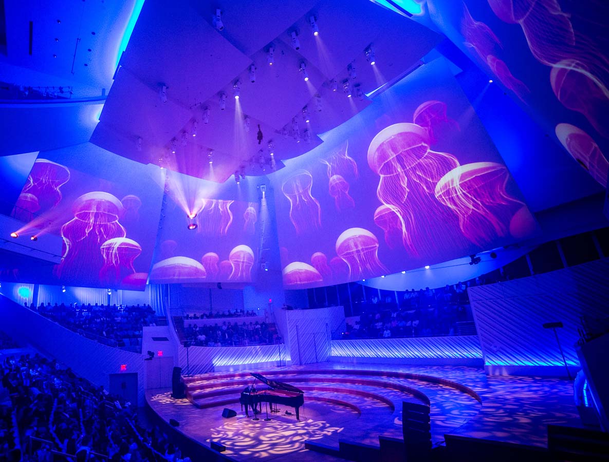
The New World Symphony was founded in 1987 by conductor Michael Tilson Thomas as an orchestral academy for gifted young musicians, a place between conservatory and professional orchestra where fellows could develop under world-class mentorship. For its first two decades it occupied the Lincoln Theater on Lincoln Road. By the early 2000s, Thomas and his long-time friend Frank Gehry began talking about what a purpose-built home might be. The result, opened in January 2011 on a site one block north of Lincoln Road in South Beach, is a 756-seat concert hall embedded in an 80-foot glass curtain wall, with a 7,000 square foot exterior projection wall broadcasting live performances free into a 2.5-acre public park alongside. Gehry kept the exterior white plaster and glass, rectangular and deliberately restrained, consistent with Miami Beach’s Art Deco character. All the ambition went inside.
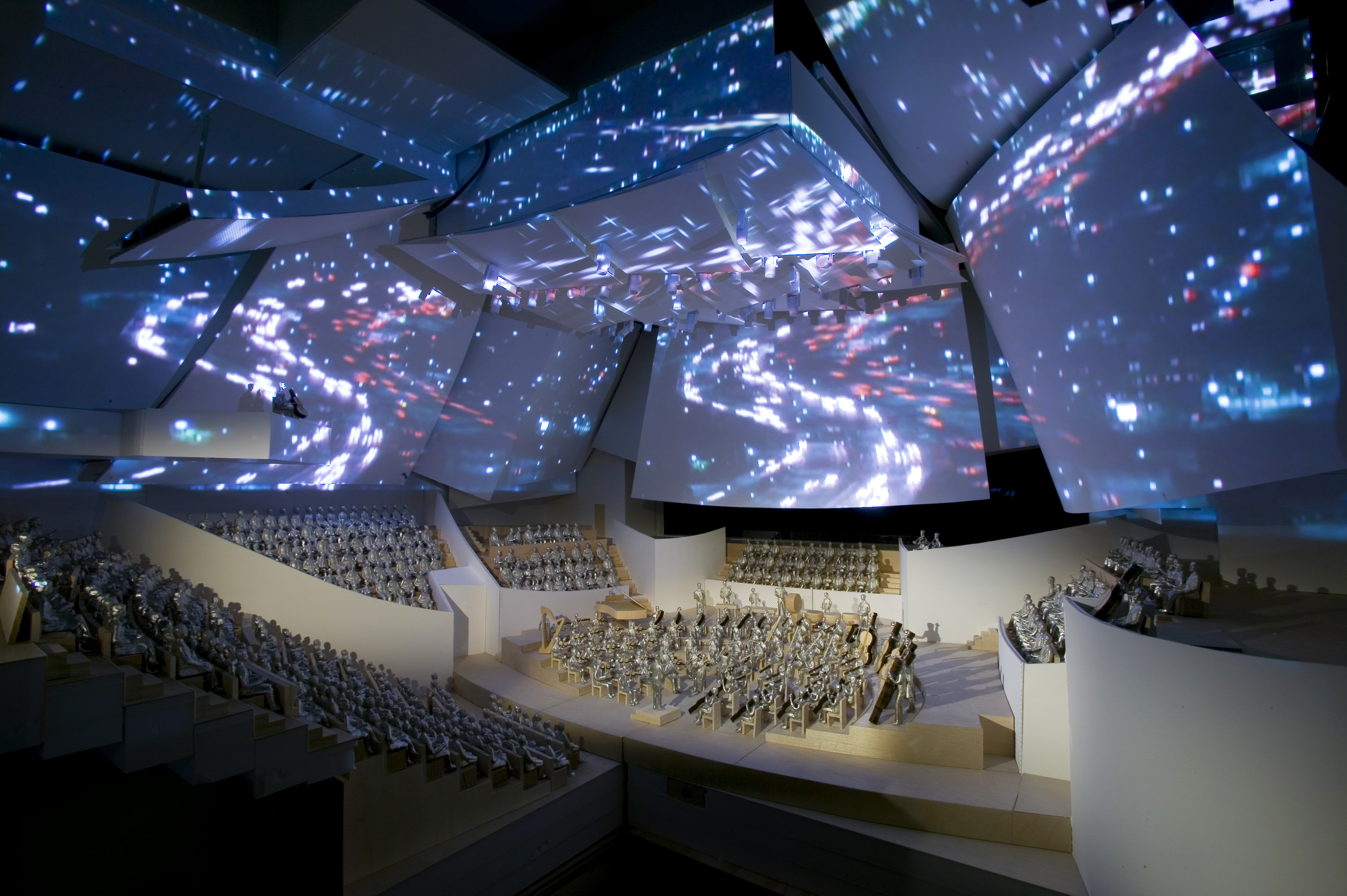
This was my first project at Gehry Partners. Every project began the same way: a site model, basswood and poplar, built by hand in the model shop. Until the site and context were understood physically, there was no design. That was the rule. The concert hall itself was the starting point for everything else, and the design moved outward from it. The acoustical reflectors and ceiling sails came first, modeled in consultation with Yasuhisa Toyota, the acoustician who had worked with Gehry on Walt Disney Concert Hall, and who worked directly with the physical models to perform his analysis. Holding those reflectors required a structural armature, and the solution that emerged quickly was a minimal wooden framework of intersecting elements that created something unexpected, extravagant and spiky, almost cathedral-like in its overhead complexity. Frank took a liking to it. That language found its way into other projects in the office afterward, though not into this one. The budget was tight and the client a non-profit, and the design was eventually pared to a cleaner version of the box, with all of that complexity contained within.
One of the early iterations was essentially a glass box, with the reflectors and the structural armature fully visible from the street. The idea of making the interior life of the building free and public was something Frank cared about. The projection wall that broadcasts concerts into the park is the built version of that instinct. The asymmetrical arrangement of the hall was informed by studying precedents, among them a handful of controversial asymmetrical concert halls from the 1970s and 80s in Europe, where the relationship between performer and audience had been deliberately unsettled.
I met Michael Tilson Thomas several times during the project. I worked closely with Yasu Toyota. And I remember a Saturday early in the process when I came into the office, which was usually empty on weekends, and found Frank standing at my model with two of the partners, discussing it. He asked what I thought. I told him I had been thinking about it differently than the direction the conversation was heading, and asked if I could disagree. He said please do. He told me he would prefer I not agree with him. That exchange has stayed with me longer than almost anything else from those years.
This was my first project at Gehry Partners. Every project began the same way: a site model, basswood and poplar, built by hand in the model shop. Until the site and context were understood physically, there was no design. That was the rule. The concert hall itself was the starting point for everything else, and the design moved outward from it. The acoustical reflectors and ceiling sails came first, modeled in consultation with Yasuhisa Toyota, the acoustician who had worked with Gehry on Walt Disney Concert Hall, and who worked directly with the physical models to perform his analysis. Holding those reflectors required a structural armature, and the solution that emerged quickly was a minimal wooden framework of intersecting elements that created something unexpected, extravagant and spiky, almost cathedral-like in its overhead complexity. Frank took a liking to it. That language found its way into other projects in the office afterward, though not into this one. The budget was tight and the client a non-profit, and the design was eventually pared to a cleaner version of the box, with all of that complexity contained within.
One of the early iterations was essentially a glass box, with the reflectors and the structural armature fully visible from the street. The idea of making the interior life of the building free and public was something Frank cared about. The projection wall that broadcasts concerts into the park is the built version of that instinct. The asymmetrical arrangement of the hall was informed by studying precedents, among them a handful of controversial asymmetrical concert halls from the 1970s and 80s in Europe, where the relationship between performer and audience had been deliberately unsettled.
I met Michael Tilson Thomas several times during the project. I worked closely with Yasu Toyota. And I remember a Saturday early in the process when I came into the office, which was usually empty on weekends, and found Frank standing at my model with two of the partners, discussing it. He asked what I thought. I told him I had been thinking about it differently than the direction the conversation was heading, and asked if I could disagree. He said please do. He told me he would prefer I not agree with him. That exchange has stayed with me longer than almost anything else from those years.
05
ZAHA HADID ARCHITECTS
London, 2012–2023
ZHA at that moment was extraordinary, an office of remarkable design talent winning work primarily through competition and generating ideas at an impressive pace. Competition-driven rather than commissioned, entirely digital rather than physical, the design approach was a significant departure from Gehry’s. With a deep talent pool of hundreds of designers, mostly trained under Zaha and Patrik, there was an extraordinary design synergy in the office. What was rare was the experience of carrying that complexity through to a built outcome, of knowing not just how to design a building but how to deliver one. That gap made ZHA the right place at the right time.
ZAHA HADID ARCHITECTS
West 28th Street
(520 West 28th)
(520 West 28th)
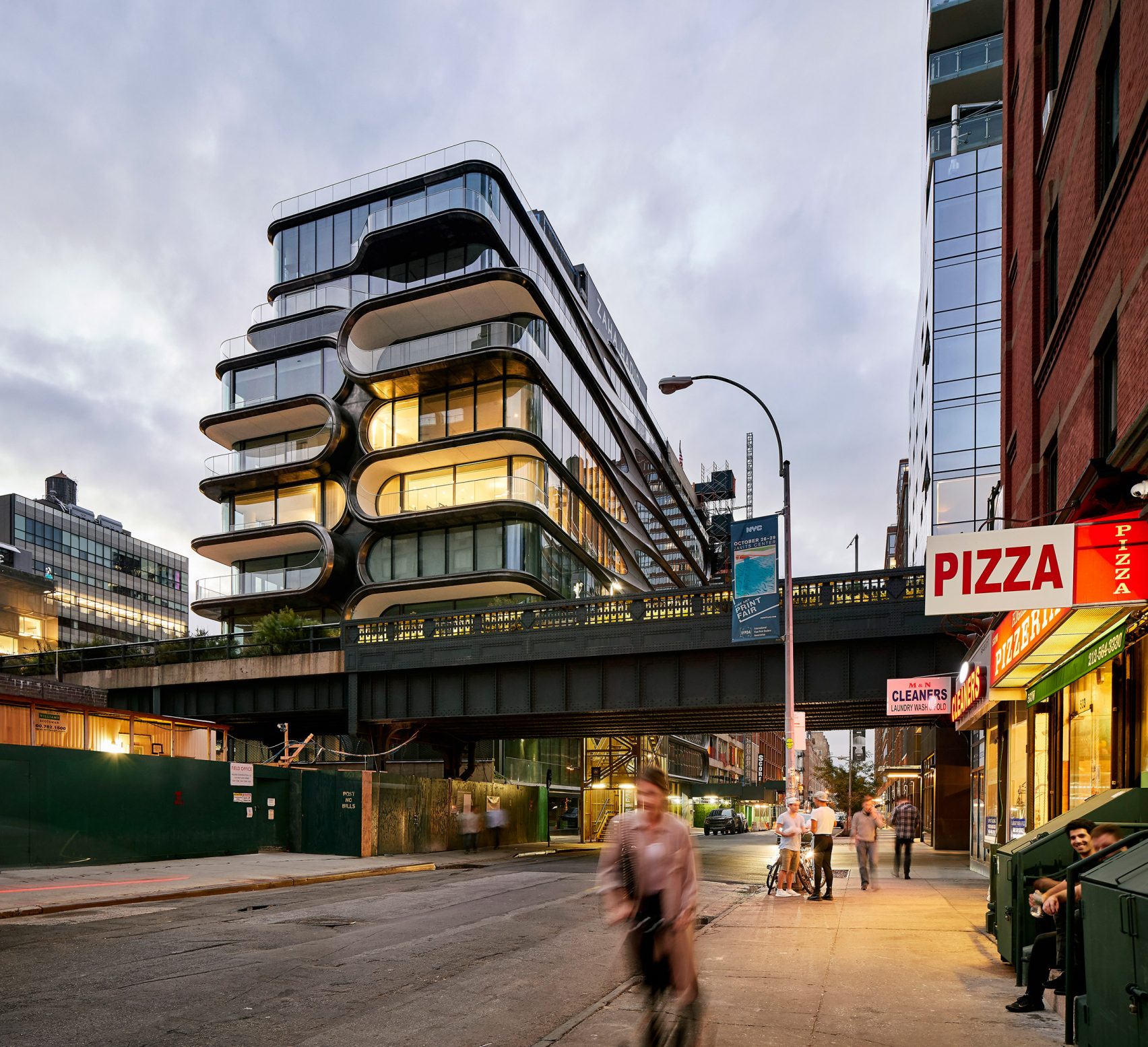
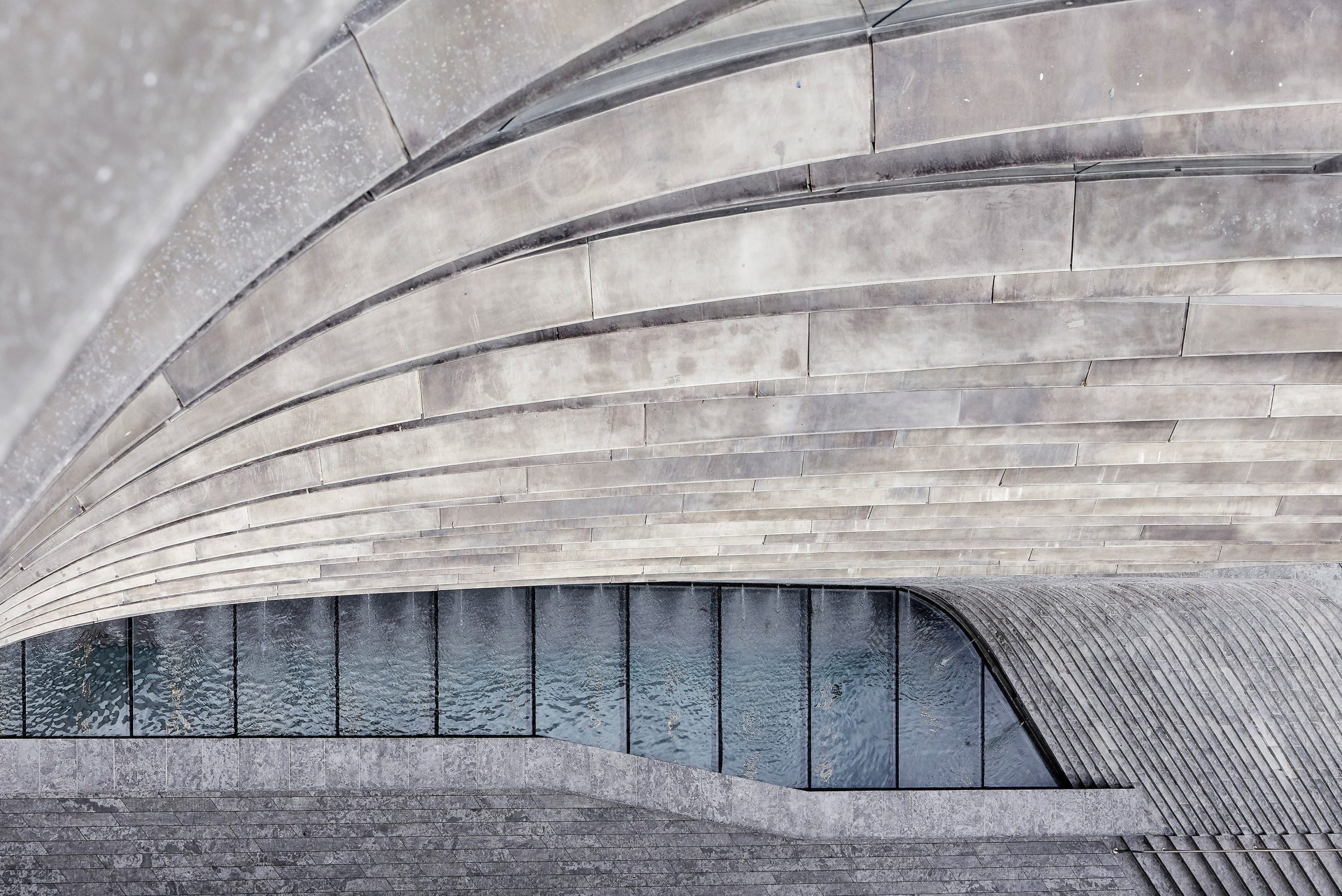
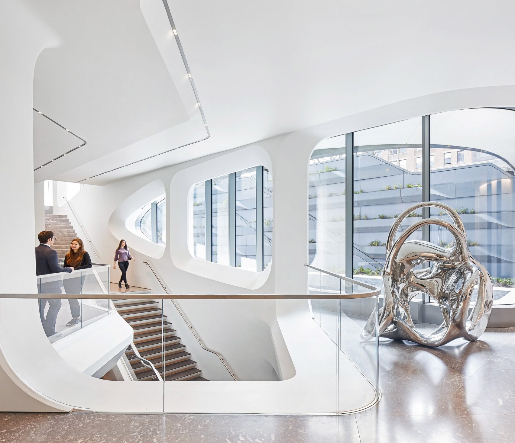
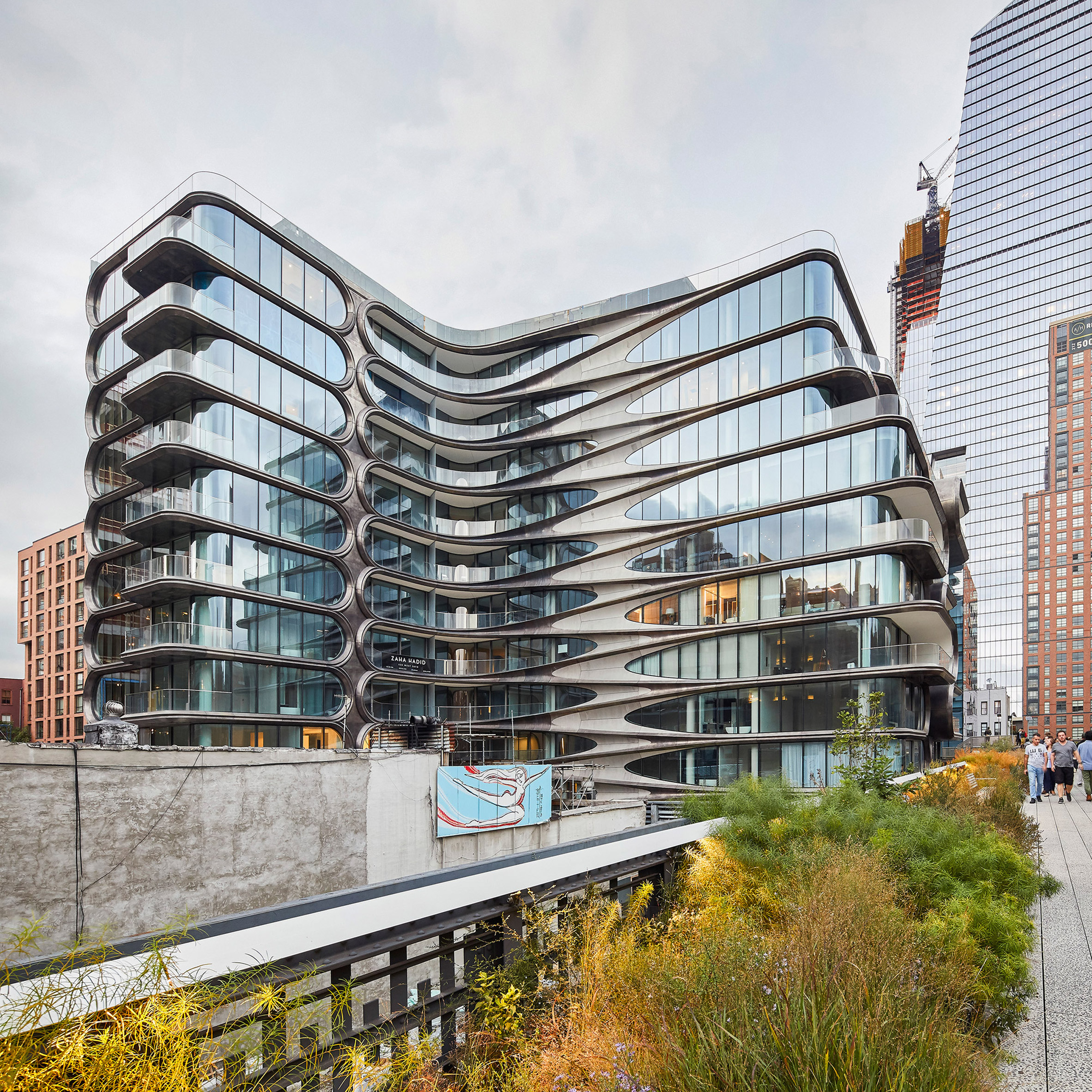
The High Line was, for almost fifty years, a mysterious and unattainable interlayer in the city. A freight-only line flanked by warehouses and factories, it was vital to Manhattan’s economy and entirely removed from its perception. Today, restored as the world’s most distinctive park, it once again connects different parts of the city, but instead of an isolated conduit, its many interfaces with the city’s ground-scape create a unique, multi-layered pedestrian experience. That transformation also made West Chelsea into something it had never been before, a global center for contemporary art. The former industrial buildings along 10th and 11th Avenues, from 18th to 28th Street, became home to over 350 galleries, the flagship spaces of the most significant dealers in the world. The West 28th Street site sits at that nexus, the northern edge of that community, where the High Line and the streetscape meet most powerfully. Commissioned by Related Companies as ZHA’s first residential project in New York, 520 West 28th comprises 39 residences across 11 stories, ranging from two to five bedrooms.
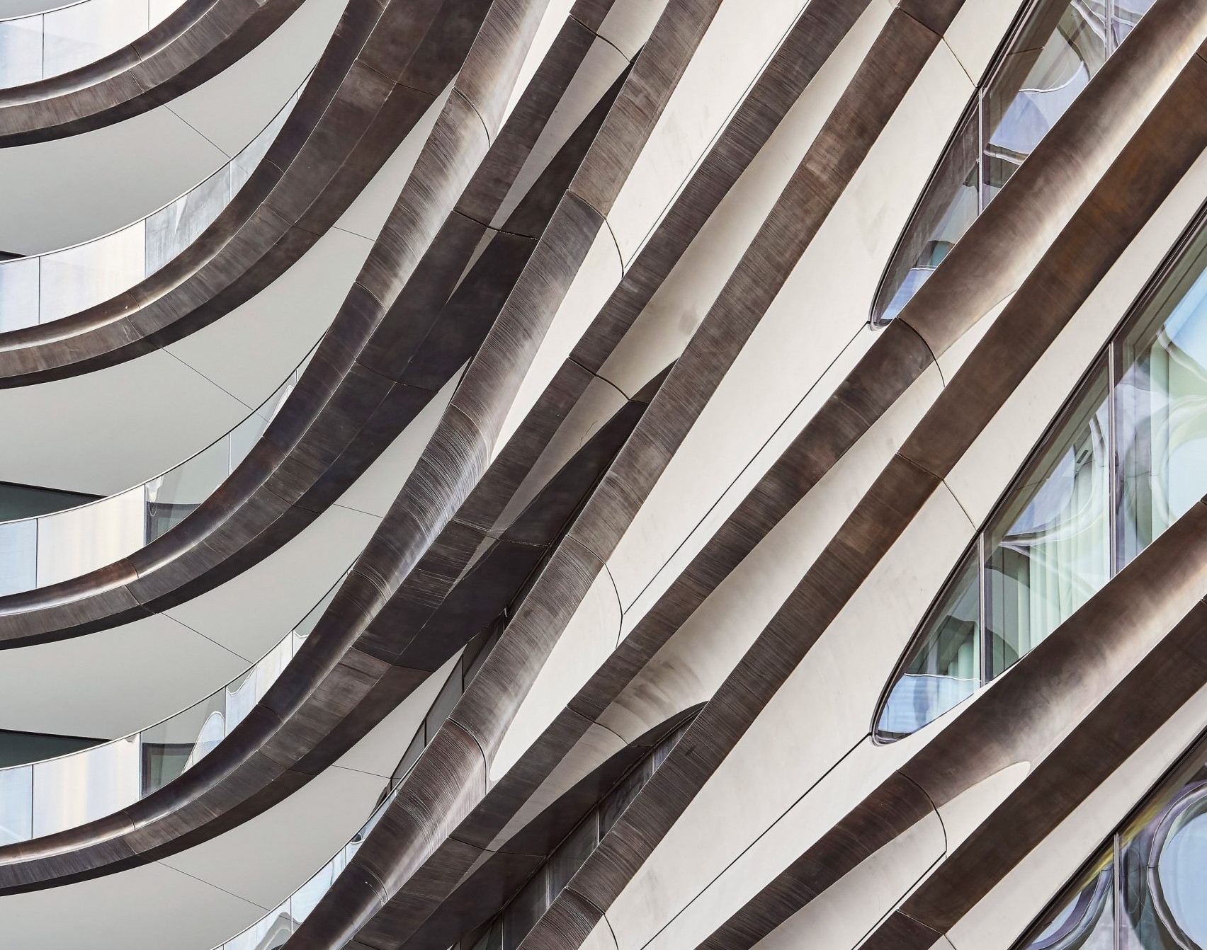
Designing for that condition meant addressing two pedestrian experiences simultaneously, the street below and the elevated park perpendicular. The response was drawn from the site’s own industrial history, from the image of railroad tracks converging as they leave a station, multiple lines drawing back into one. The chevron became the unifying gesture for the entire facade and the split-level condition of the building. The C-shapes of the balconies return at the edge of the building and create a continuous loop that stitches street level to the High Line to the penthouses above. The more solid, opaque parts of the chevron were converged to hide the service spaces and the more private areas of the building, while the social spaces like living and dining open outward toward the park and the neighborhood.
When the client expanded the program after the commission was awarded, additional units began to conflict with the original vision. In some cases the chevron would start to block the views for the new spaces. In others, new areas requiring privacy were suddenly exposed. Holding the logic of the chevron intact through those changes, resolving each new condition without dissolving the original concept, was the central challenge on this project.
Designing for that condition meant addressing two pedestrian experiences simultaneously, the street below and the elevated park perpendicular. The response was drawn from the site’s own industrial history, from the image of railroad tracks converging as they leave a station, multiple lines drawing back into one. The chevron became the unifying gesture for the entire facade and the split-level condition of the building. The C-shapes of the balconies return at the edge of the building and create a continuous loop that stitches street level to the High Line to the penthouses above. The more solid, opaque parts of the chevron were converged to hide the service spaces and the more private areas of the building, while the social spaces like living and dining open outward toward the park and the neighborhood.
When the client expanded the program after the commission was awarded, additional units began to conflict with the original vision. In some cases the chevron would start to block the views for the new spaces. In others, new areas requiring privacy were suddenly exposed. Holding the logic of the chevron intact through those changes, resolving each new condition without dissolving the original concept, was the central challenge on this project.
07
ZAHA HADID ARCHITECTS
Murray Road
(The Henderson)
(The Henderson)
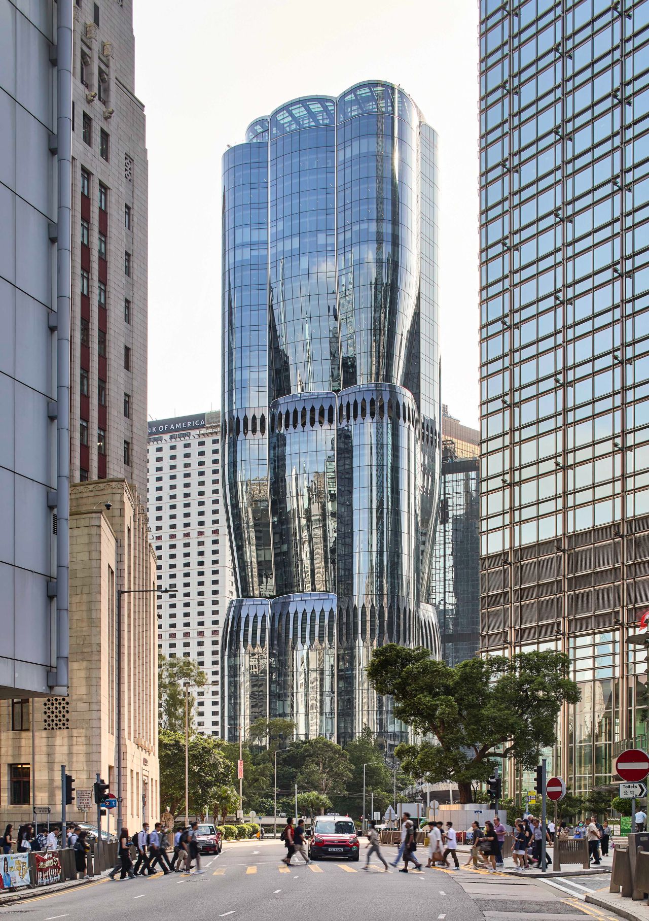
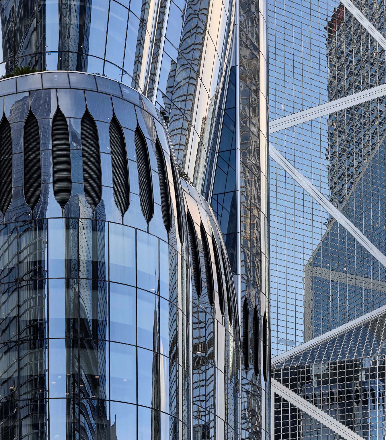
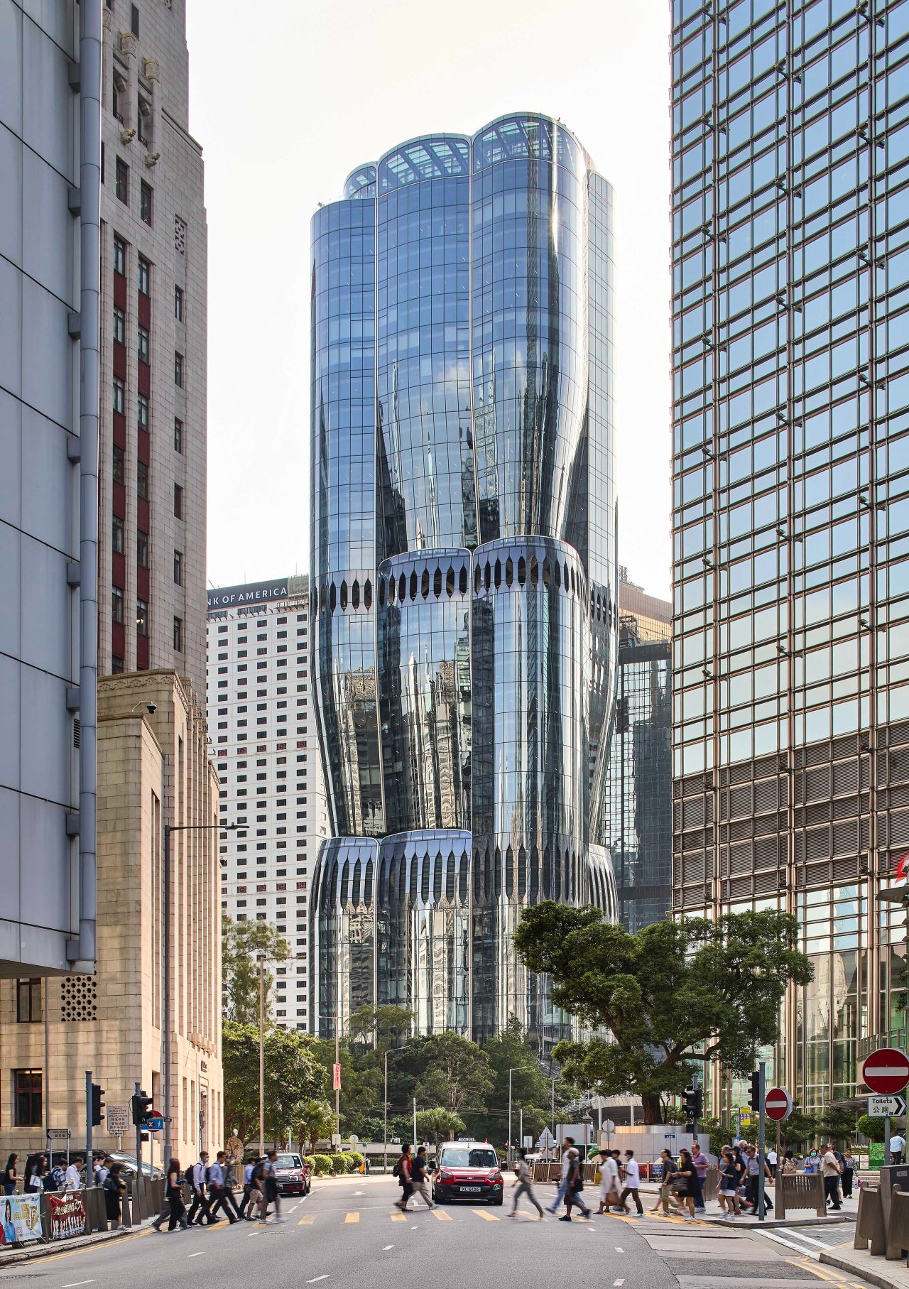
Murray Road occupies one of the most charged sites in Hong Kong’s Central Business District. Facing Chater Garden, the building stands in direct company with IM Pei’s Bank of China Tower, Foster’s HSBC headquarters, and Paul Rudolph’s Lippo Centre, a constellation of some of the most significant towers in Asia’s most competitive skyline. The site, reportedly the world’s most expensive plot of land at $3 billion when purchased by Henderson Land in 2017, carried with it an explicit ambition: to usher in a new era of high design for Hong Kong, led by a new generation of the Henderson family.
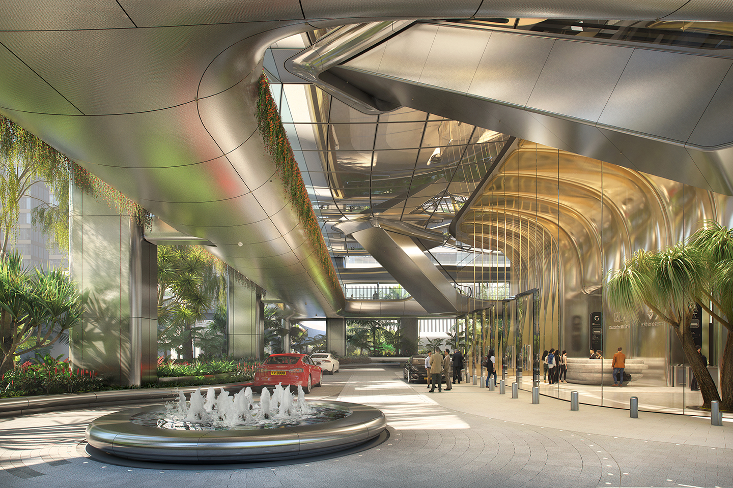
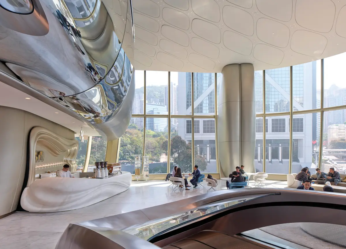
The project came to me after the competition win, when Patrik Schumacher and the design director asked me to help deliver the vision. I took ownership of the arrival experience and the overall facade geometry, spending six months in Hong Kong working through both. The building’s ground condition is unlike most Western towers. Hong Kong’s elevated pedestrian walkway network means the primary lobby sits at the second floor, connected directly to the city’s circulation above the street. Designing the arrival meant simultaneously addressing two levels, the traditional ground presence for car arrival and pedestrian traffic connecting to Chater Garden, and the elevated entry from the walkway above. The facade geometry, inspired by the layered forms of the Bauhinia bud, Hong Kong’s orchid tree, was critical to the client’s vision and had to be protected through every phase of development.
The central challenge was building that vision without losing it. As the project developed, the engineering demands grew heavier and more complex, particularly at the belly of the tower, where the primary arrival from the elevated walkway occurs. The panels there are the most technically demanding on the project, double-curved, double-glazed glass hung upside down with minimal joints. The compression of space and structure at that point was significant. Rather than rationalizing it away, I used that compression to intensify the arrival experience, making the most constrained moment in the building its most spatial.
The project came to me after the competition win, when Patrik Schumacher and the design director asked me to help deliver the vision. I took ownership of the arrival experience and the overall facade geometry, spending six months in Hong Kong working through both. The building’s ground condition is unlike most Western towers. Hong Kong’s elevated pedestrian walkway network means the primary lobby sits at the second floor, connected directly to the city’s circulation above the street. Designing the arrival meant simultaneously addressing two levels, the traditional ground presence for car arrival and pedestrian traffic connecting to Chater Garden, and the elevated entry from the walkway above. The facade geometry, inspired by the layered forms of the Bauhinia bud, Hong Kong’s orchid tree, was critical to the client’s vision and had to be protected through every phase of development.
The central challenge was building that vision without losing it. As the project developed, the engineering demands grew heavier and more complex, particularly at the belly of the tower, where the primary arrival from the elevated walkway occurs. The panels there are the most technically demanding on the project, double-curved, double-glazed glass hung upside down with minimal joints. The compression of space and structure at that point was significant. Rather than rationalizing it away, I used that compression to intensify the arrival experience, making the most constrained moment in the building its most spatial.
08
ZAHA HADID ARCHITECTS
OPPO Headquarters
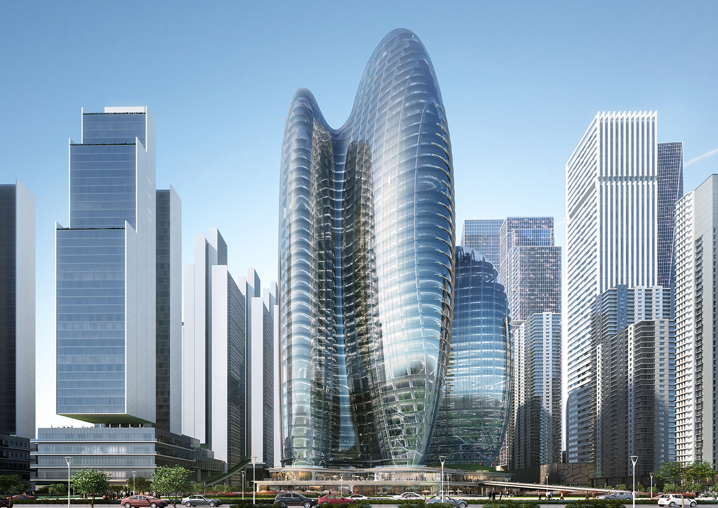
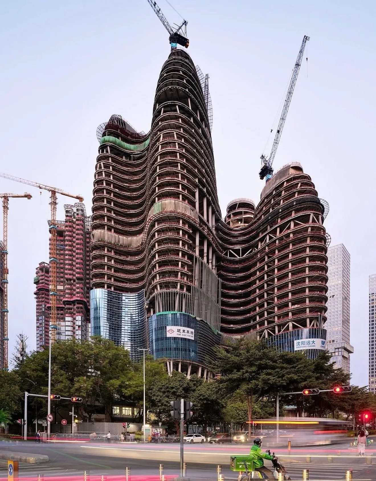
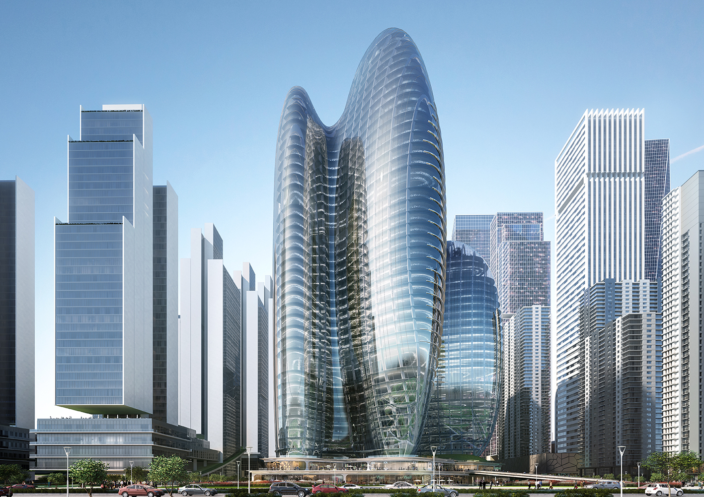
Shenzhen is one of the most extraordinary urban stories of the twentieth century, a fishing village that became a city of 17 million in roughly four decades, built on the ambition of China’s technology industry. OPPO, founded in 2008 and now the country’s leading smartphone manufacturer with over 40,000 employees across 40 countries, commissioned a headquarters that would reflect that ambition. ZHA won an international competition that included BIG, SOM, and Rogers Stirk Harbour, proposing four interconnected towers reaching 200 meters across 185,000 square meters, oriented to maximize views over Shenzhen Bay and conceived as a new civic space for the city rather than a closed corporate enclave.
The team was talented and the design ambitious. Patrik Schumacher had brought me in specifically for the combination of design sensibility and delivery experience, a pairing that was genuinely rare at that level. My role extended across all packages, mentoring the team through design development and delivery. What I identified early was a disconnect at the heart of the competition scheme: the podium sat as a separate element beneath the towers, their energy never reaching the ground. The team was wrestling with it. That became my focus.
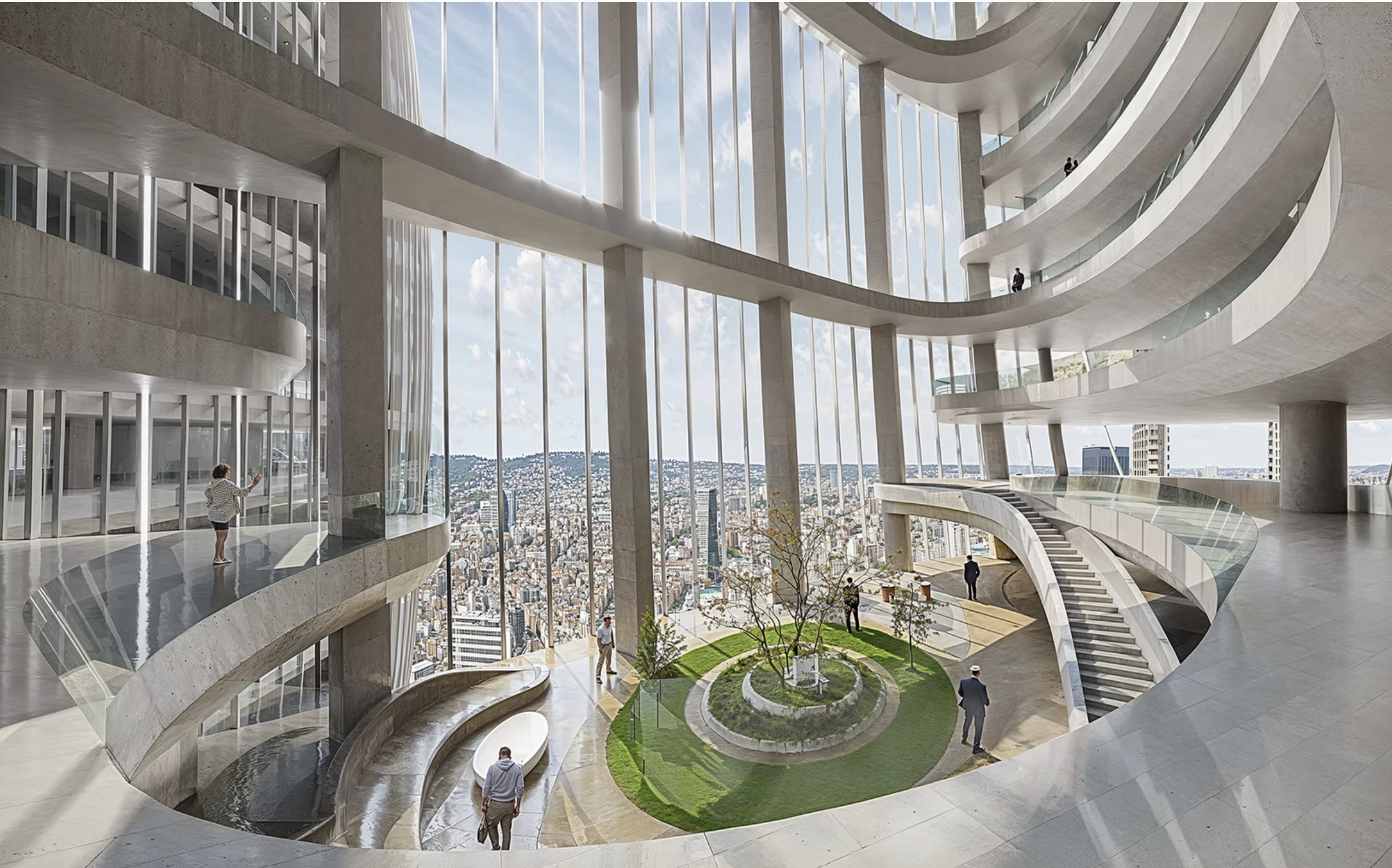
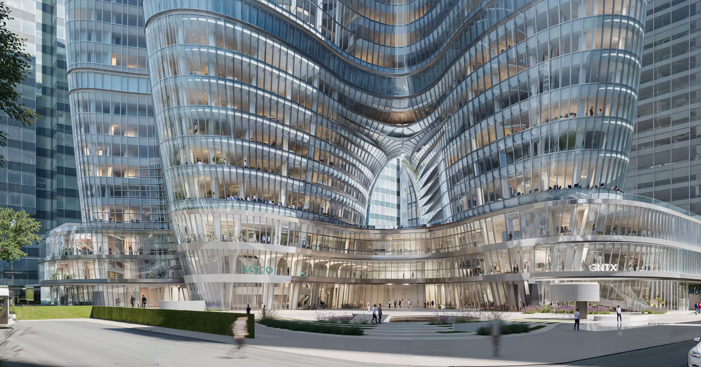
The original competition renders showed the towers sitting on a plinth, a formal separation between the building above and the ground below. There was no continuity between the energy of the towers and the way they met the city. What I focused on was physically reshaping that interface, eliminating the plinth and allowing the language of the towers to flow all the way down to the ground. The podium became a continuous element, ribbons of form wrapping the base of the towers and pulling the arrival experience into direct relationship with the building above. The result was no longer a building sitting on a base. It was one continuous form, fluid from tower to ground, with the arrival experience and the pedestrian scale fully integrated into the overall design. I also worked on the atrium spaces within the podium, bringing human scale and communal space into a building that could otherwise read as purely monumental.
The team was talented and the design ambitious. Patrik Schumacher had brought me in specifically for the combination of design sensibility and delivery experience, a pairing that was genuinely rare at that level. My role extended across all packages, mentoring the team through design development and delivery. What I identified early was a disconnect at the heart of the competition scheme: the podium sat as a separate element beneath the towers, their energy never reaching the ground. The team was wrestling with it. That became my focus.
The original competition renders showed the towers sitting on a plinth, a formal separation between the building above and the ground below. There was no continuity between the energy of the towers and the way they met the city. What I focused on was physically reshaping that interface, eliminating the plinth and allowing the language of the towers to flow all the way down to the ground. The podium became a continuous element, ribbons of form wrapping the base of the towers and pulling the arrival experience into direct relationship with the building above. The result was no longer a building sitting on a base. It was one continuous form, fluid from tower to ground, with the arrival experience and the pedestrian scale fully integrated into the overall design. I also worked on the atrium spaces within the podium, bringing human scale and communal space into a building that could otherwise read as purely monumental.
09
ZAHA HADID ARCHITECTS
Nanjing International
Youth Cultural Centre
Youth Cultural Centre
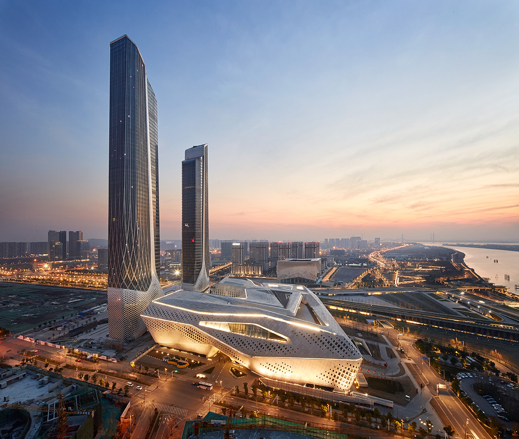
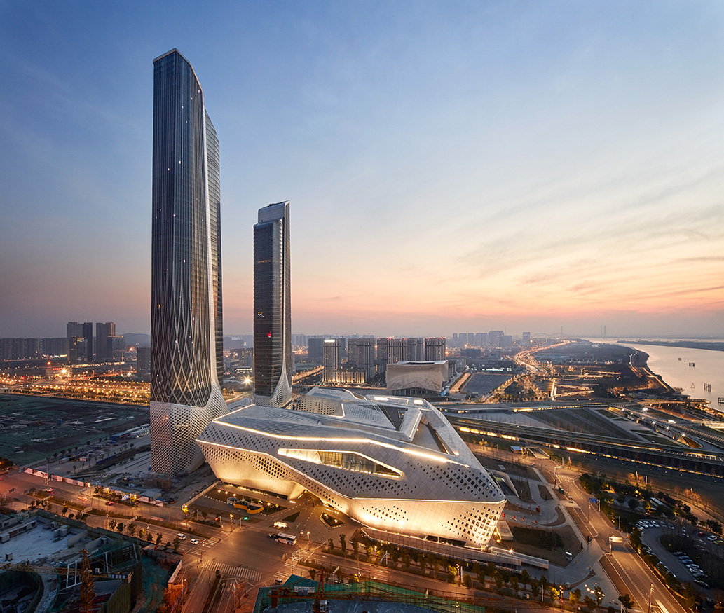
Nanjing sits at one of China’s most historically loaded sites, the former capital of the Republic, a city of 1,600 years of continuous culture, now staking its future on a new central business district carved from the Yangtze River’s edge. The Nanjing International Youth Cultural Centre was designed to anchor that district, catalyzed by the 2014 Youth Olympic Games and intended to outlast them. At 465,000 square meters across two towers reaching 255 and 315 meters, it was ZHA’s most ambitious built project at the time, and one of the most technically complex facades the office had ever attempted.
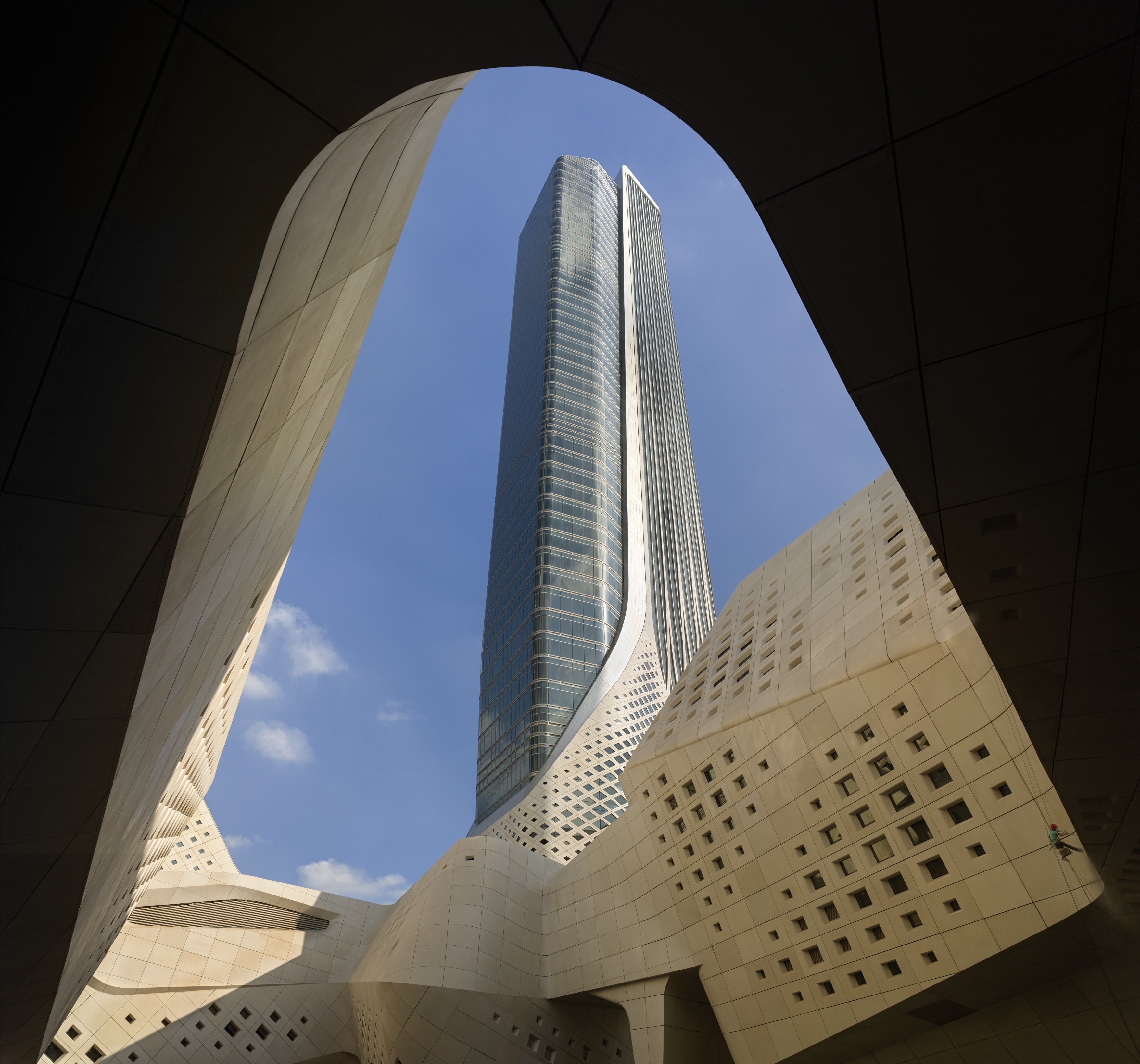
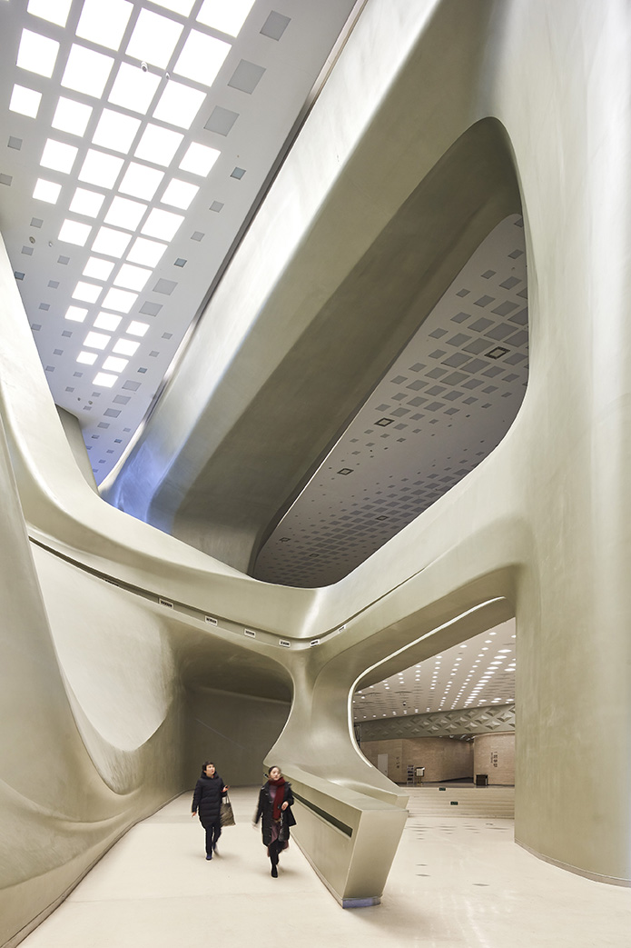
Joining the project approximately 18 months from completion, the office had won the competition two years earlier with a single tower scheme that had grown, through a significant redesign during schematic design, into two towers with a far more complex facade system. A gifted junior designer had developed an intricate origami double-skin facade in Grasshopper, striking in its ambition. The job was to deliver it. Working in CATIA, the only tool with the precision and scale to handle the geometry properly and expeditiously, was the clear choice. Before diving into production, the first order of business was what any designer would do: evaluate the quality of the spaces. The structure of the double-skin facade was blocking the views from the interior of the building outward. A redesign was proposed that would preserve the visual character of the facade while correcting the interior condition, but was overruled. The lesson stayed with me.
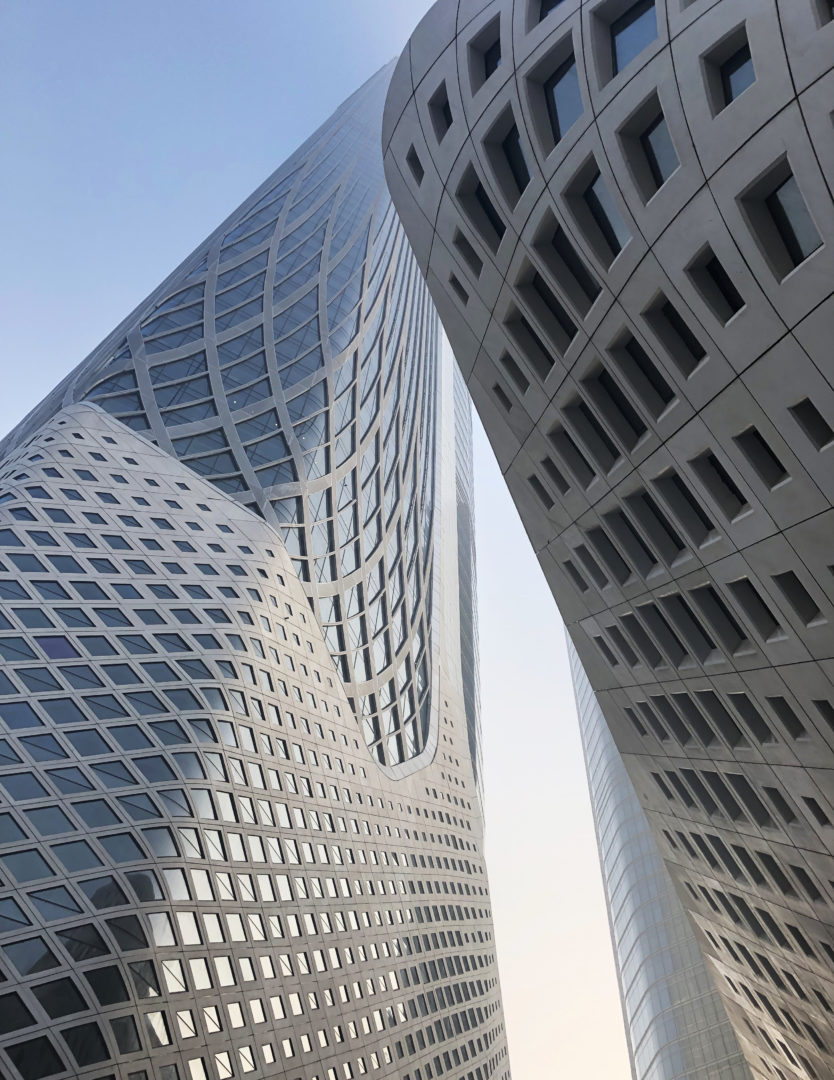
After delivering the full facade package under the constraints of a contract requiring all documentation in 2D, despite the geometry having been worked out precisely in a 3D CATIA model, a 300-page document set of the unfolded facade geometry was produced to communicate it completely. Mock-ups were built by two competing contractors. Visually, from the outside, the result was exactly as designed. From the inside, it was exactly as predicted. The client’s response was direct and the timeline was unforgiving. Less than twelve months from the Youth Olympic Games opening, there was no facade.
The solution was found in the archive. Returning to the project for several weeks, an earlier design iteration was adapted and the facade geometry redesigned from scratch to make it work. With the technological foundation already in place, the translation into the new system took roughly a month. It got built. The project opened on time. What you see in every published photograph of the Nanjing International Youth Cultural Centre is that redesign.
Joining the project approximately 18 months from completion, the office had won the competition two years earlier with a single tower scheme that had grown, through a significant redesign during schematic design, into two towers with a far more complex facade system. A gifted junior designer had developed an intricate origami double-skin facade in Grasshopper, striking in its ambition. The job was to deliver it. Working in CATIA, the only tool with the precision and scale to handle the geometry properly and expeditiously, was the clear choice. Before diving into production, the first order of business was what any designer would do: evaluate the quality of the spaces. The structure of the double-skin facade was blocking the views from the interior of the building outward. A redesign was proposed that would preserve the visual character of the facade while correcting the interior condition, but was overruled. The lesson stayed with me.
After delivering the full facade package under the constraints of a contract requiring all documentation in 2D, despite the geometry having been worked out precisely in a 3D CATIA model, a 300-page document set of the unfolded facade geometry was produced to communicate it completely. Mock-ups were built by two competing contractors. Visually, from the outside, the result was exactly as designed. From the inside, it was exactly as predicted. The client’s response was direct and the timeline was unforgiving. Less than twelve months from the Youth Olympic Games opening, there was no facade.
The solution was found in the archive. Returning to the project for several weeks, an earlier design iteration was adapted and the facade geometry redesigned from scratch to make it work. With the technological foundation already in place, the translation into the new system took roughly a month. It got built. The project opened on time. What you see in every published photograph of the Nanjing International Youth Cultural Centre is that redesign.
10
ZAHA HADID ARCHITECTS
412 St. Kilda Road
(The Mayfair)
(The Mayfair)
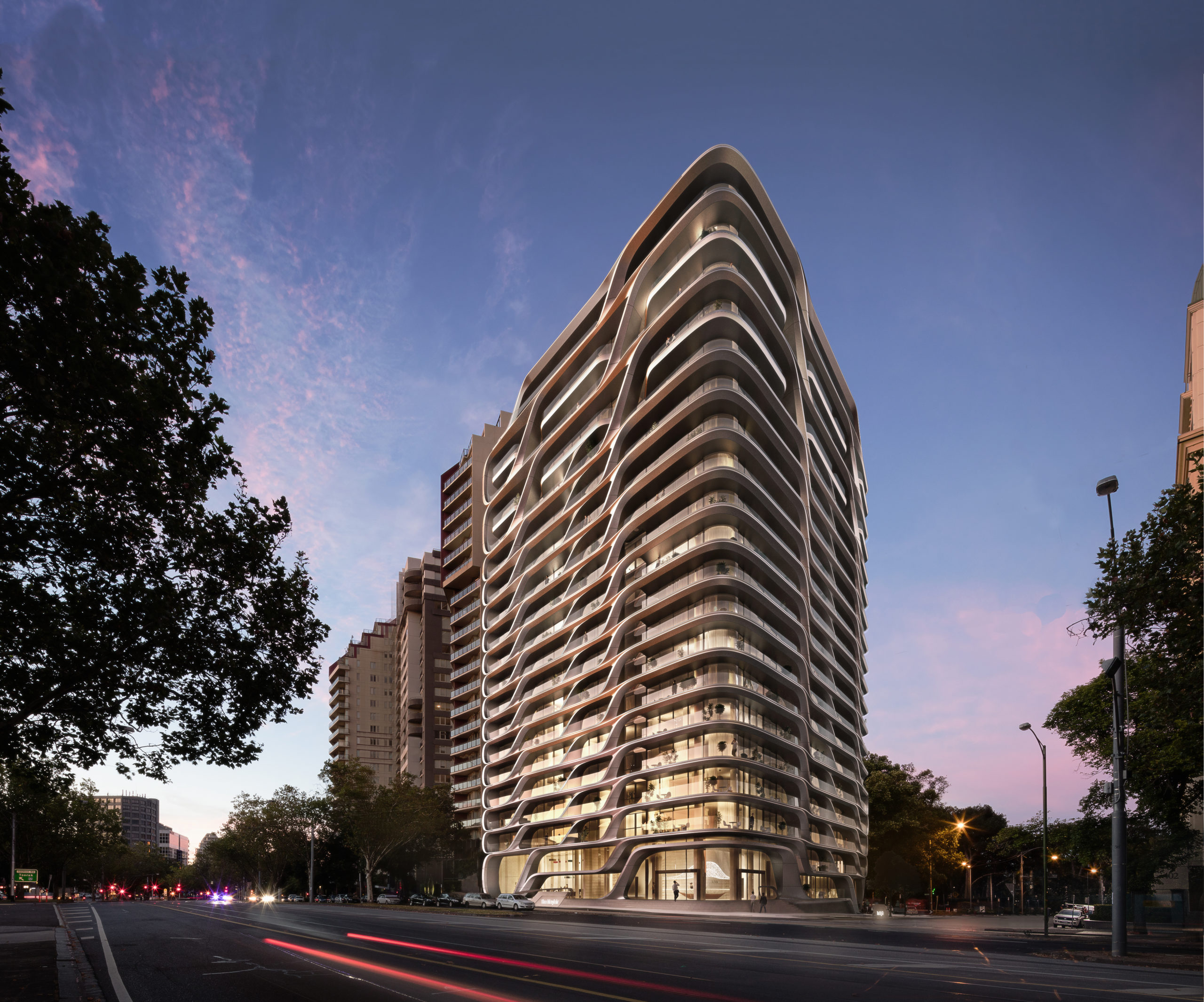
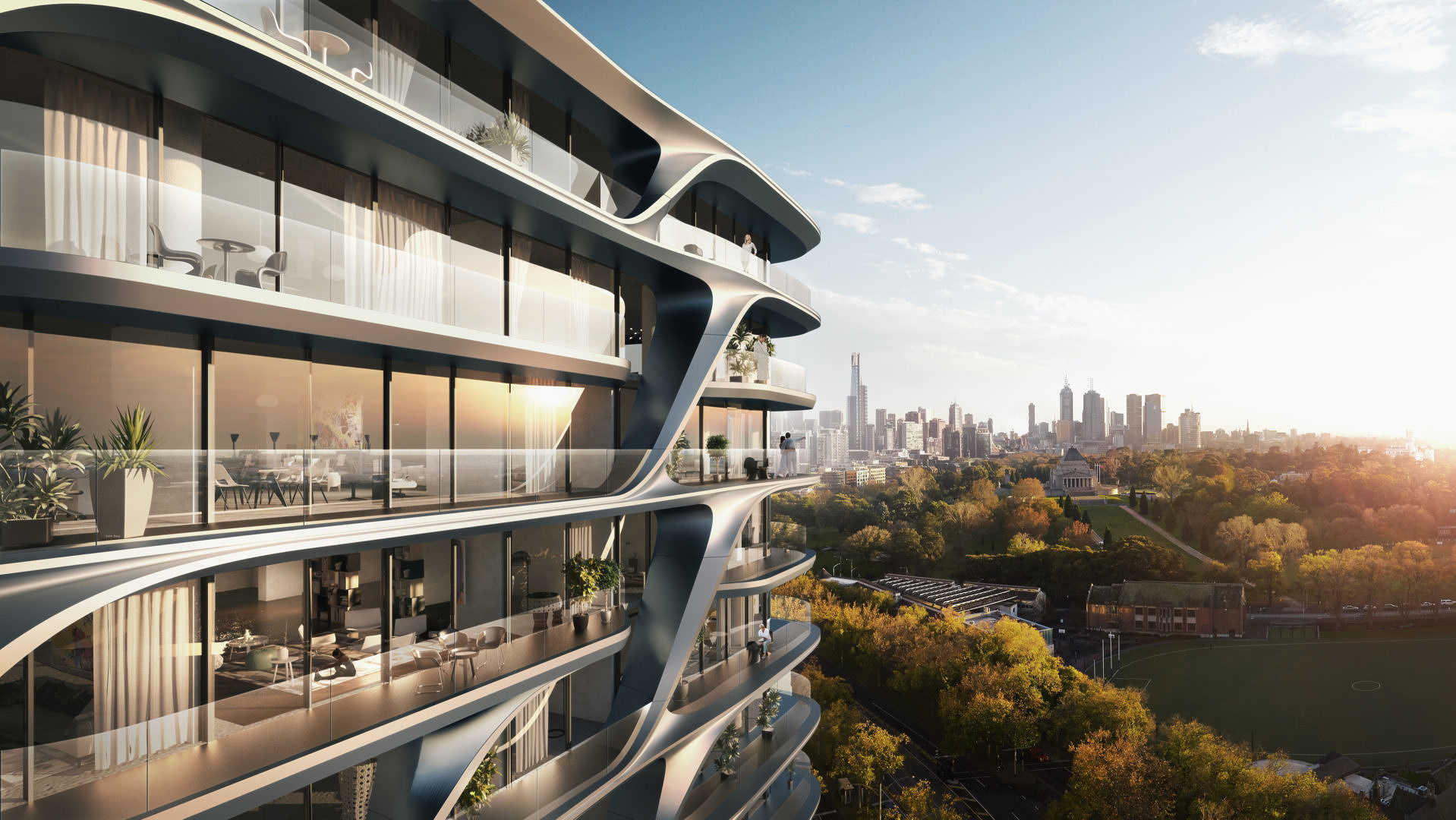
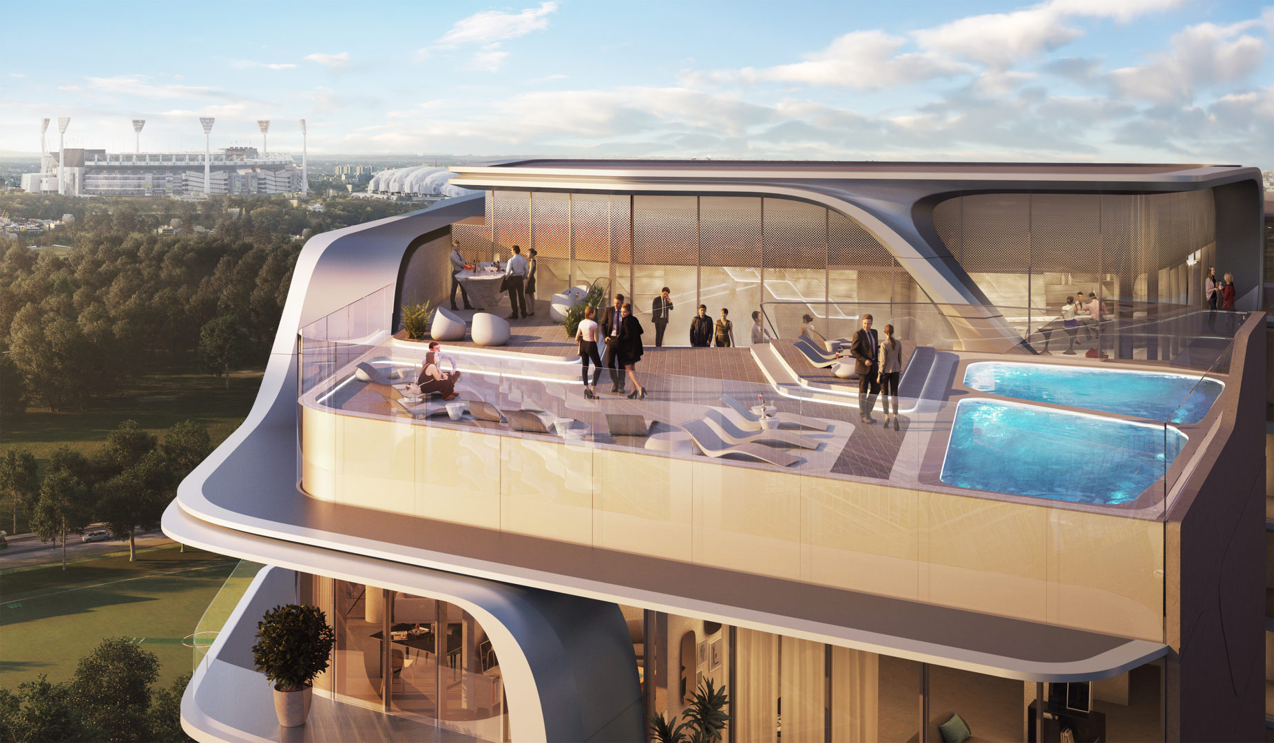
St Kilda Road is Melbourne’s grandest boulevard, a tree-lined avenue connecting the city center to the bay, lined with institutions, embassies, and some of the city’s most significant residential addresses. The site at 412 St Kilda Road had housed the Victoria Police headquarters for decades, a civic anchor at the edge of the Arts Precinct, facing the Royal Botanic Gardens with views across Port Phillip Bay and the CBD skyline. Developer UEM Sunrise, a Malaysian government-linked company with ambitions for the site beyond what a previous approval had offered, held an invited competition in 2016. ZHA won it. The Mayfair, as the project came to be known, was to be 19 stories, 158 residences, a restaurant and cafe at street level, rooftop terraces and pools above.
Having just delivered West 28th Street in New York, the design language was familiar. Both projects share a formal logic rooted in fluid looping geometry, the exterior wall expression doubling as the generator of the residential experience within. At ZHA at that time, projects of this complexity and scale were arriving faster than the office’s capacity to deliver them. The experience and seniority to carry a building from design geometry through construction documentation was genuinely scarce. The decision to bring that capacity to this project was straightforward. The work that needed doing was clear.
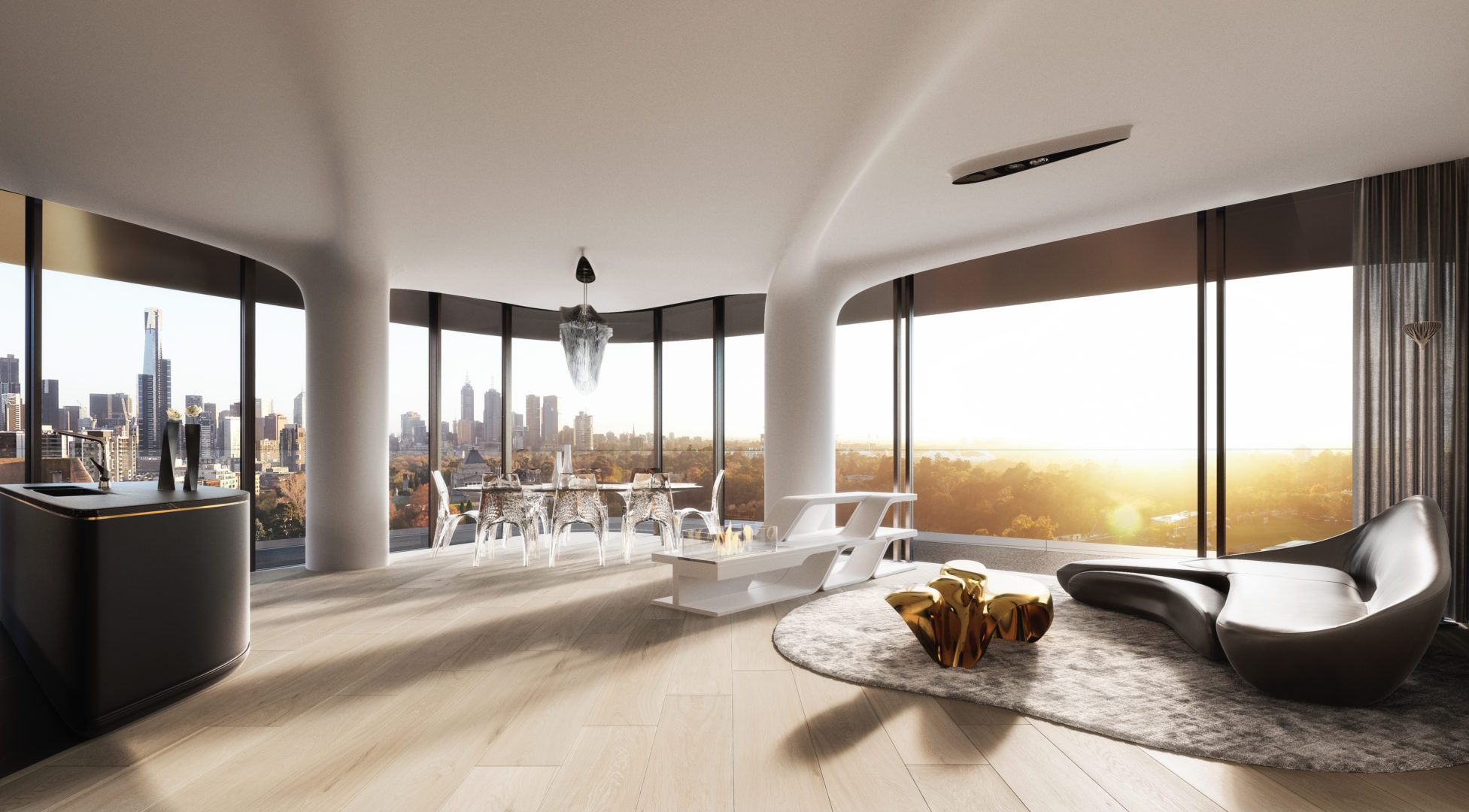
The competition geometry was raw. Every surface had to be redesigned from the ground up, because the unit layouts had changed and the geometry had to follow. What that meant in practice was rebuilding the entire facade system, then tracing how it folded into the interior of each unit, down through the arrival sequence, into the lobby and amenity spaces, out to the rooftop terrace and landscape. In the ZHA model, the facade is never just a facade. It is the organizing gesture that weaves every experience together, from the ground plane to the roof. All of that geometry was rebuilt, coordinated with the interiors team, the landscape, and the rooftop, and carried through to construction documentation.
The project was shelved before the tower was built. Melbourne real estate had risen sharply enough that the land itself, with a ZHA planning permit attached, was worth more to the developer than completing the building. The police station was never demolished. The showroom and sales suite were fitted out inside it, built directly from the design geometry. Every published render of The Mayfair came from that geometry. The building exists in full detail. It simply was not built.
Having just delivered West 28th Street in New York, the design language was familiar. Both projects share a formal logic rooted in fluid looping geometry, the exterior wall expression doubling as the generator of the residential experience within. At ZHA at that time, projects of this complexity and scale were arriving faster than the office’s capacity to deliver them. The experience and seniority to carry a building from design geometry through construction documentation was genuinely scarce. The decision to bring that capacity to this project was straightforward. The work that needed doing was clear.
The competition geometry was raw. Every surface had to be redesigned from the ground up, because the unit layouts had changed and the geometry had to follow. What that meant in practice was rebuilding the entire facade system, then tracing how it folded into the interior of each unit, down through the arrival sequence, into the lobby and amenity spaces, out to the rooftop terrace and landscape. In the ZHA model, the facade is never just a facade. It is the organizing gesture that weaves every experience together, from the ground plane to the roof. All of that geometry was rebuilt, coordinated with the interiors team, the landscape, and the rooftop, and carried through to construction documentation.
The project was shelved before the tower was built. Melbourne real estate had risen sharply enough that the land itself, with a ZHA planning permit attached, was worth more to the developer than completing the building. The police station was never demolished. The showroom and sales suite were fitted out inside it, built directly from the design geometry. Every published render of The Mayfair came from that geometry. The building exists in full detail. It simply was not built.
11
ZAHA HADID ARCHITECTS
Additional work from the ZHA years.
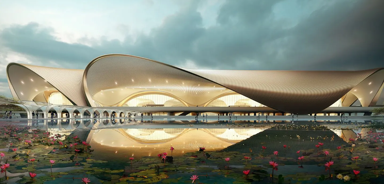
NAVI Mumbai International Airport
Mumbai, India | Built | 2018–2019
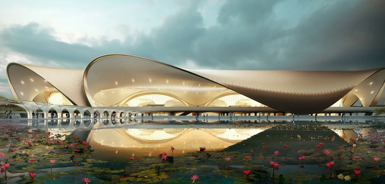
The canopy is the first thing every arriving passenger encounters, before the terminal begins. Lead Designer, schematic design and design development.
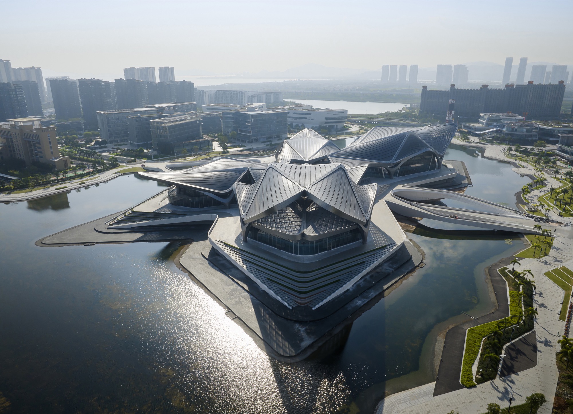
Zhuhai Jinwan Civic Art Centre
Zhuhai, China | Built | 2020
The project was on site and well into construction when the contractor returned to the office. Significant portions had not come out as designed. We were re-engaged to rebuild the podium geometries for fabrication, and the built outcome is that work. Design lead, construction administration.
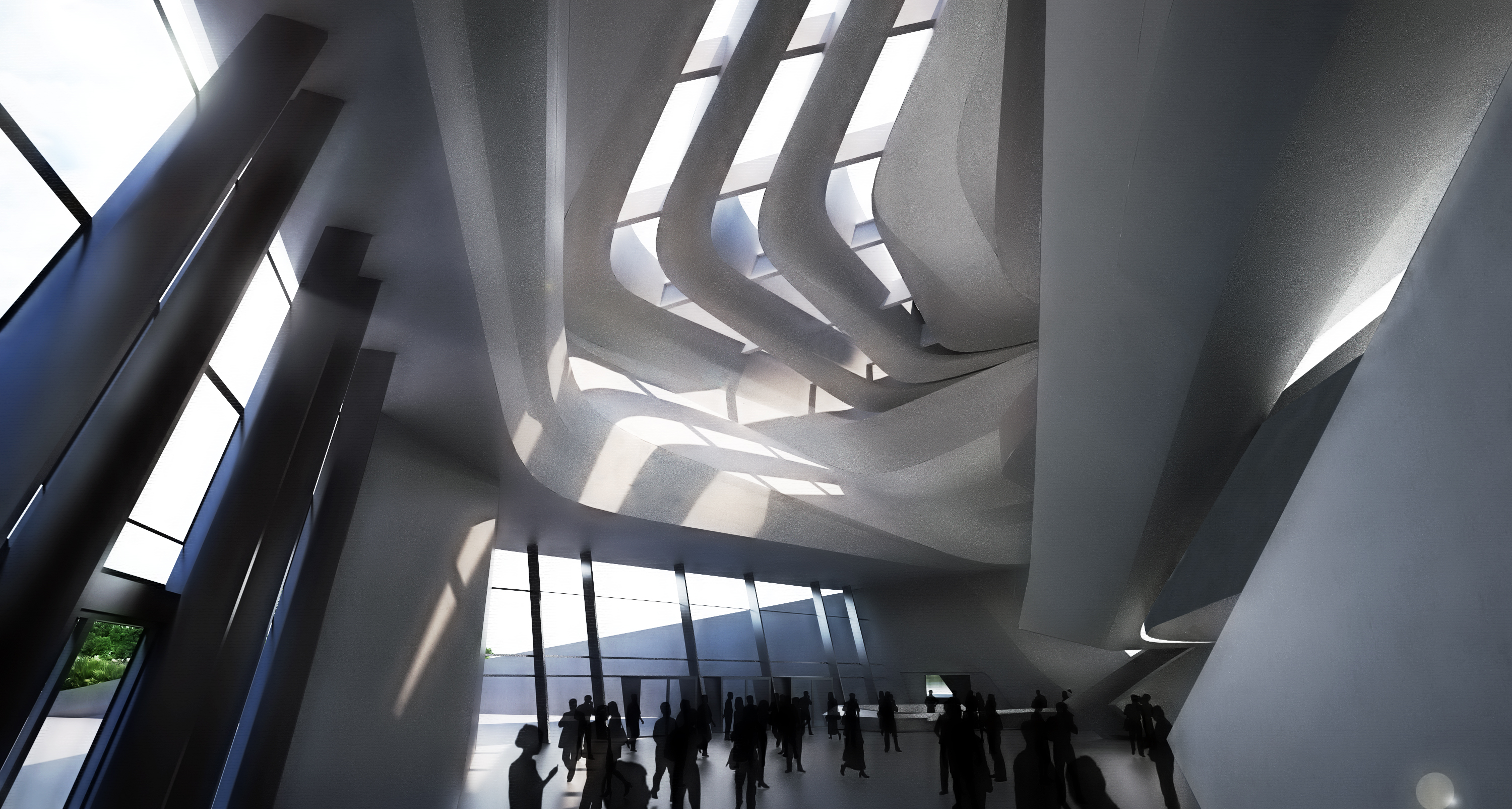
Grand Theatre de Rabat
Rabat, Morocco | Built | 2013
A monolithic concrete form generated by the energy of the Bouregreg River, wrapping two auditoria and carving the foyer into grand staircases that flow from the landscape outside to the performance spaces within. Senior Designer.
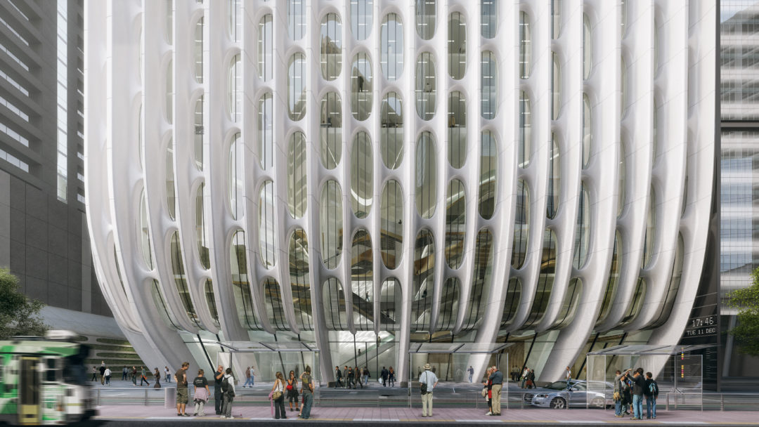
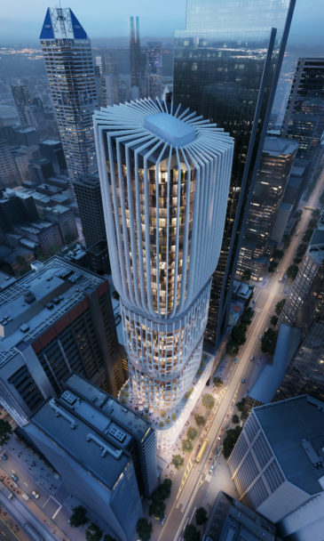
Mandarin Oriental Melbourne
Melbourne, Australia | Unbuilt | 2017–2018
Four stacked volumes, each tapering at its base, the building’s overall mass broken down into a series of distinct programmatic vessels. The facade reinterprets Melbourne’s historic masonry detailing through a contemporary filigree that runs continuously across the exterior wall. Lead Designer, schematic design and design development.
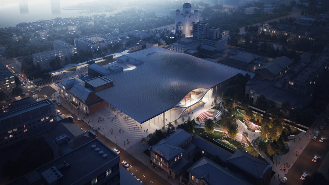
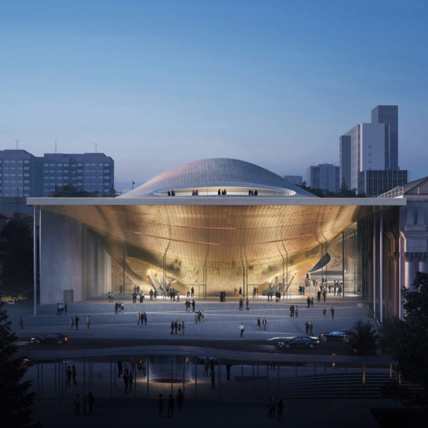
Sverdlovsk Philharmonic Concert Hall
Yekaterinburg, Russia | In Development | 2020
The form of the building is derived from the physics of sound, two auditoria suspended within a canopy shaped by sine wave resonance, floating above a public plaza that serves as both lobby and civic square. Design lead, concept and schematic design.
11
UNSTUDIO
Amsterdam, 2009–2011
UNStudio was a firm I had watched closely as a student. Ben van Berkel’s work occupied a particular position in the early 2000s, rigorously parametric, deeply interested in the relationship between geometry and movement, between form and flow. The decision to move to Europe was personal. Two of the studio’s directors were in New York, not much older than I was, and the conversation was easy. They knew the Gehry work. The competition was won, the team was being assembled, and the project was the largest and most significant the office had taken on. It was the right moment and a great opportunity.
UNSTUDIO
Raffles City Development
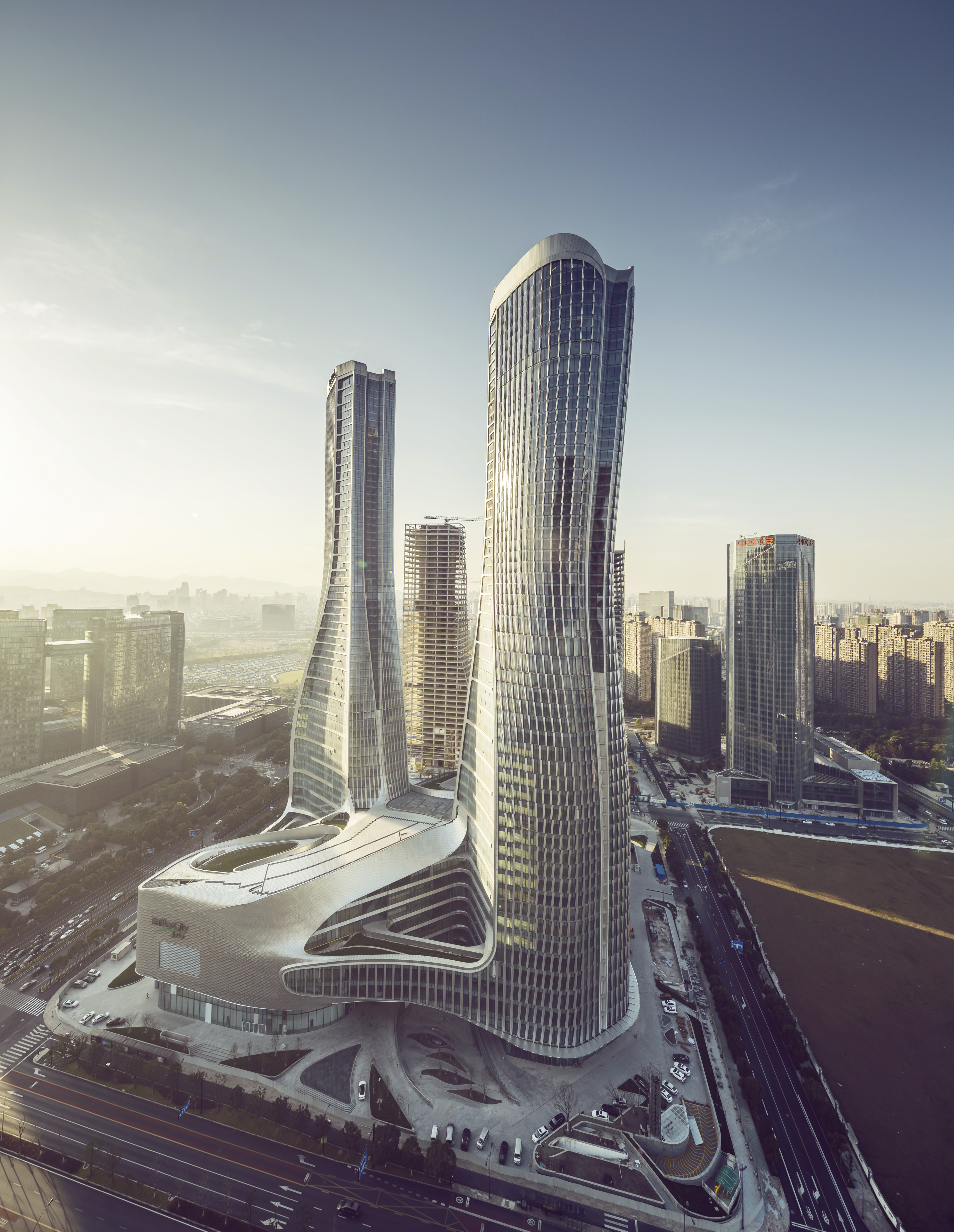
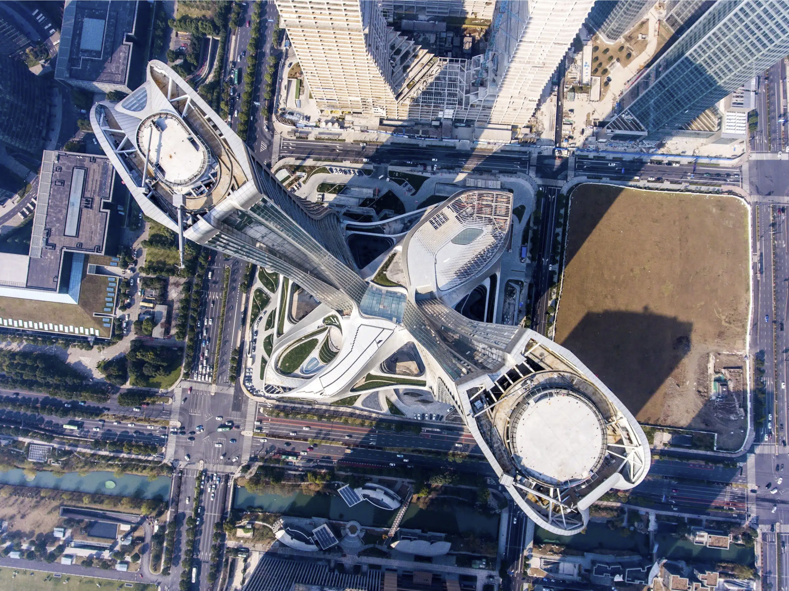
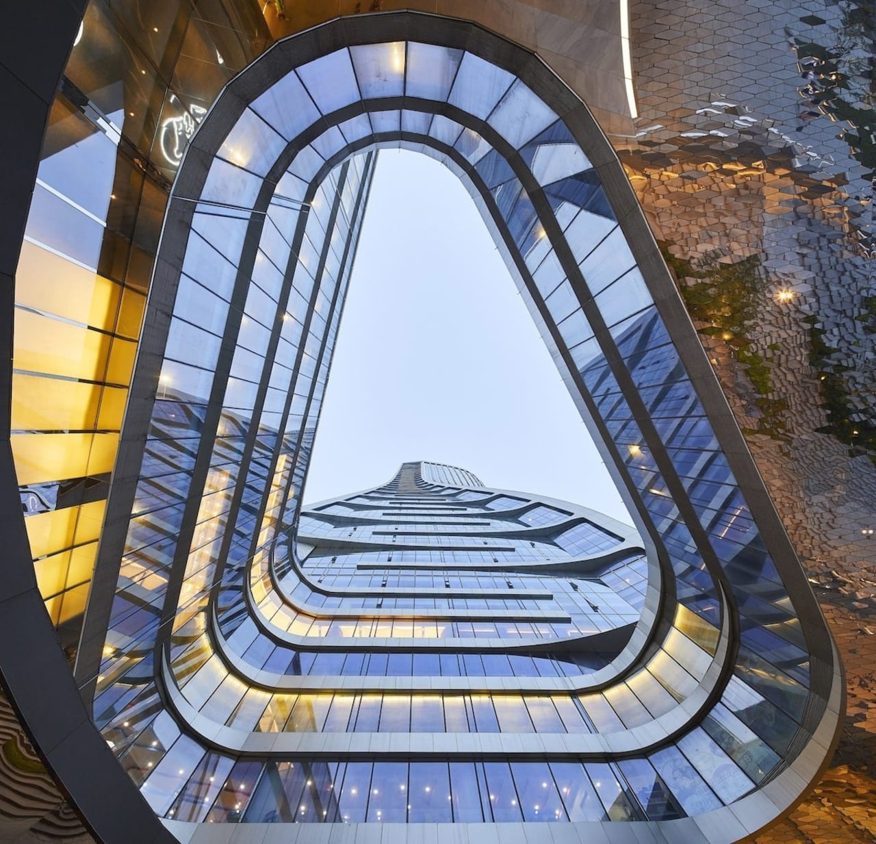
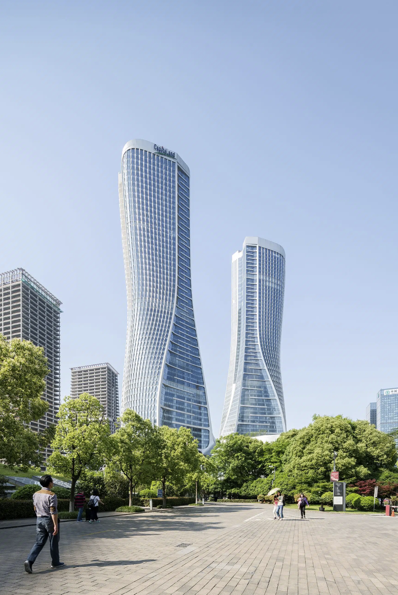
Hangzhou’s new CBD, Qianjiang New Town, oriented toward the Qiantang River rather than the historic city, was the setting for Raffles City: twin 60-story towers, a Conrad Hotel, Grade A offices, residential units, and a 116,000 square meter retail podium for CapitaLand. UNStudio won the competition with a design rooted in the city’s landscape, the towers twisting to mediate between the urban grid and the river, their wave-like facades referencing the movement of the Qiantang.
I arrived as the project entered schematic design, recruited on the strength of the Gehry Tower delivery. The team was large and junior. My approach has always favored a compact team of highly capable people, and what I brought here was the focus and experience to work within that constraint, coordinating a sizable but largely inexperienced group toward a precise outcome.
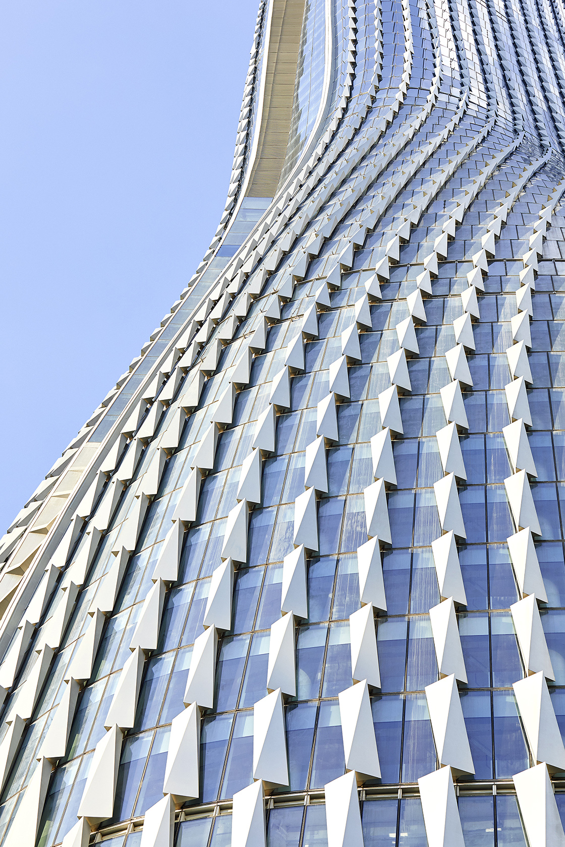
The immediate challenge was one of confidence. Moving from competition visualization to understanding the building’s constructability meant answering a direct question: can we build this, and how? With two non-identical towers, different geometries, different structural strategies, and almost no repetition between them, CapitaLand needed to believe the office had an answer. Within the first two months, a comprehensive geometric analysis mapped every panel type across both facades, principal dimensions catalogued and presented in pivot charts showing exactly where variation existed, where repetition could be introduced, and how standardized systems could carry the complexity through to fabrication. I took the presentation to China. The client’s confidence shifted.
What made that analysis possible was the fabrication knowledge that came from delivering the Gehry Tower alongside Permasteelisa, a depth of understanding about how complex geometry actually gets built. That knowledge was not part of the standard architectural contract at UNStudio, and I pushed to make sure it wasn’t given away. Architects routinely absorb work outside their scope without compensation. This was not going to be one of those cases. The office agreed, negotiated expanded scope and payment from the client, and used that revenue to fund CATIA licenses for the project. From Rhino and Grasshopper the work moved into CATIA, a platform CapitaLand had never seen used for architecture. The question in the room was simple: why is the architect doing the engineer’s work? The answer was equally simple. The engineers weren’t there, and it was our design. We should know how to build our own complexity.
CapitaLand’s skepticism gave way once the work was delivered. The technology spread through China’s architecture industry in the years that followed and is used there today more than anywhere else in the world. The planters on the landscape facades and much of the social space in the podium mall were value-engineered out, retail prioritized over public realm, a familiar negotiation at this scale. The towers stand. The geometry holds.
I arrived as the project entered schematic design, recruited on the strength of the Gehry Tower delivery. The team was large and junior. My approach has always favored a compact team of highly capable people, and what I brought here was the focus and experience to work within that constraint, coordinating a sizable but largely inexperienced group toward a precise outcome.
The immediate challenge was one of confidence. Moving from competition visualization to understanding the building’s constructability meant answering a direct question: can we build this, and how? With two non-identical towers, different geometries, different structural strategies, and almost no repetition between them, CapitaLand needed to believe the office had an answer. Within the first two months, a comprehensive geometric analysis mapped every panel type across both facades, principal dimensions catalogued and presented in pivot charts showing exactly where variation existed, where repetition could be introduced, and how standardized systems could carry the complexity through to fabrication. I took the presentation to China. The client’s confidence shifted.
What made that analysis possible was the fabrication knowledge that came from delivering the Gehry Tower alongside Permasteelisa, a depth of understanding about how complex geometry actually gets built. That knowledge was not part of the standard architectural contract at UNStudio, and I pushed to make sure it wasn’t given away. Architects routinely absorb work outside their scope without compensation. This was not going to be one of those cases. The office agreed, negotiated expanded scope and payment from the client, and used that revenue to fund CATIA licenses for the project. From Rhino and Grasshopper the work moved into CATIA, a platform CapitaLand had never seen used for architecture. The question in the room was simple: why is the architect doing the engineer’s work? The answer was equally simple. The engineers weren’t there, and it was our design. We should know how to build our own complexity.
CapitaLand’s skepticism gave way once the work was delivered. The technology spread through China’s architecture industry in the years that followed and is used there today more than anywhere else in the world. The planters on the landscape facades and much of the social space in the podium mall were value-engineered out, retail prioritized over public realm, a familiar negotiation at this scale. The towers stand. The geometry holds.
14
COOP HIMMELB(L)AU
Vienna, 2001–2002
Wolf Prix’s work excited me as a student years before he was an employer. His radical commitment to architecture, the bold ideas pursued without compromise, a certain disdain for convention, was something I had studied and admired long before Tom Wiscombe made the introduction. Working in the studio confirmed what the practice had suggested: an office that went all in, every time, because Prix believed that was the only honest way to practice. That conviction left a lasting impression.
COOP HIMMELB(L)AU
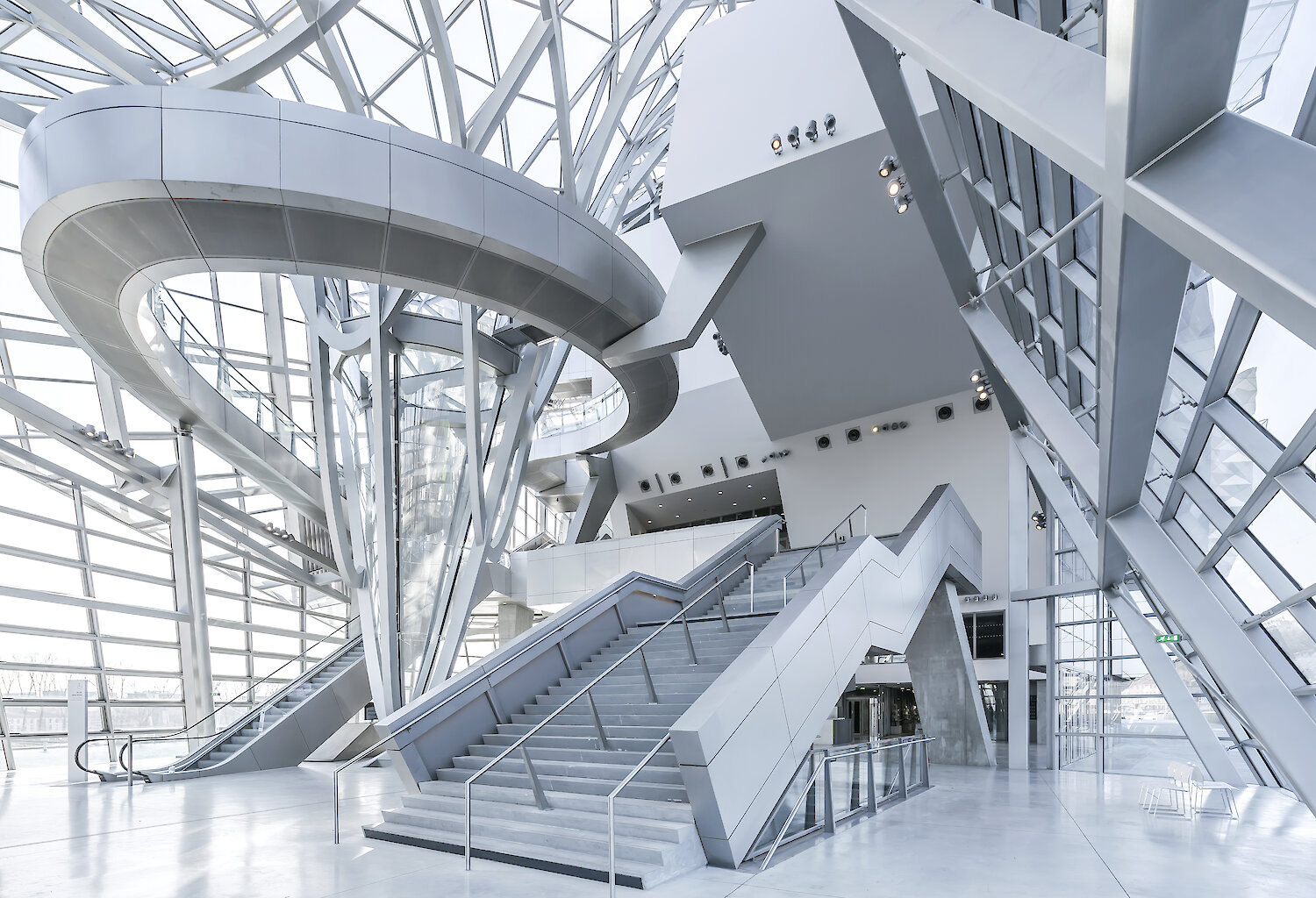
Musée des Confluences
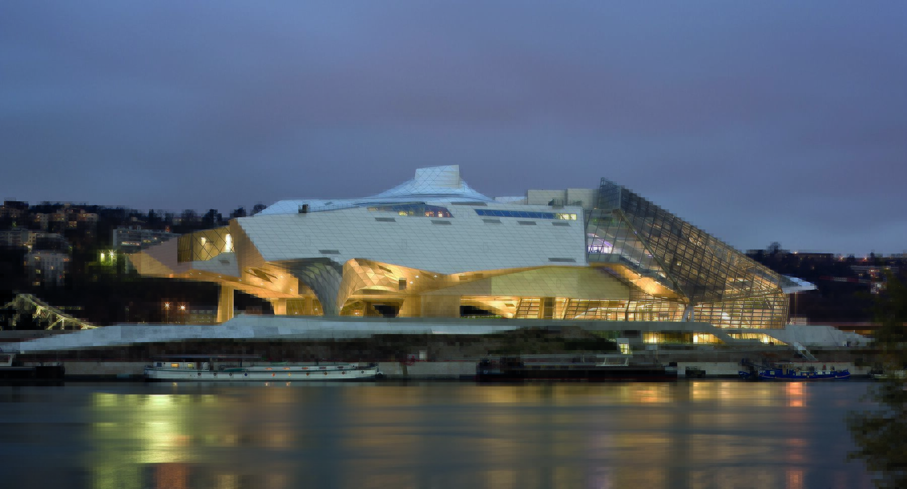
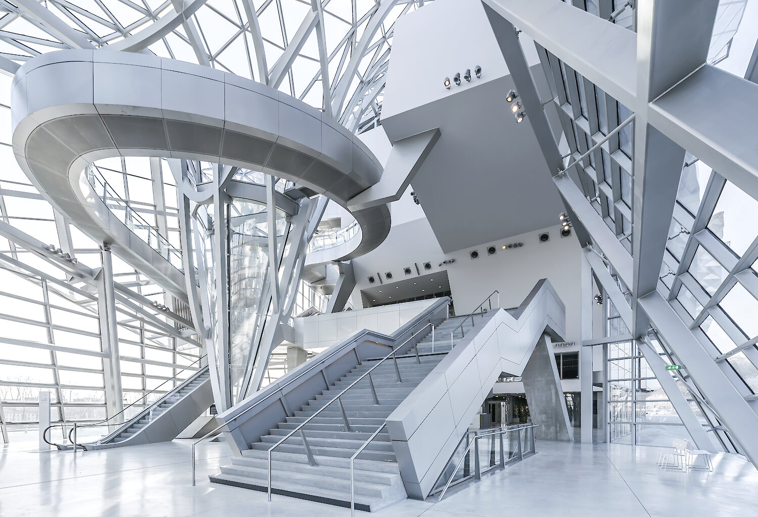
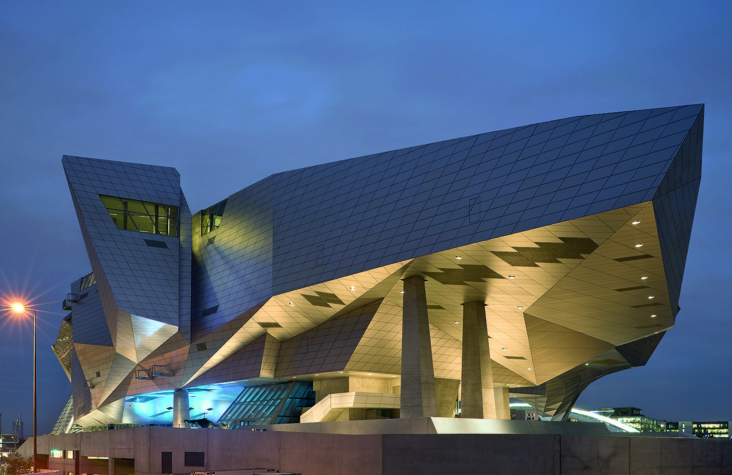
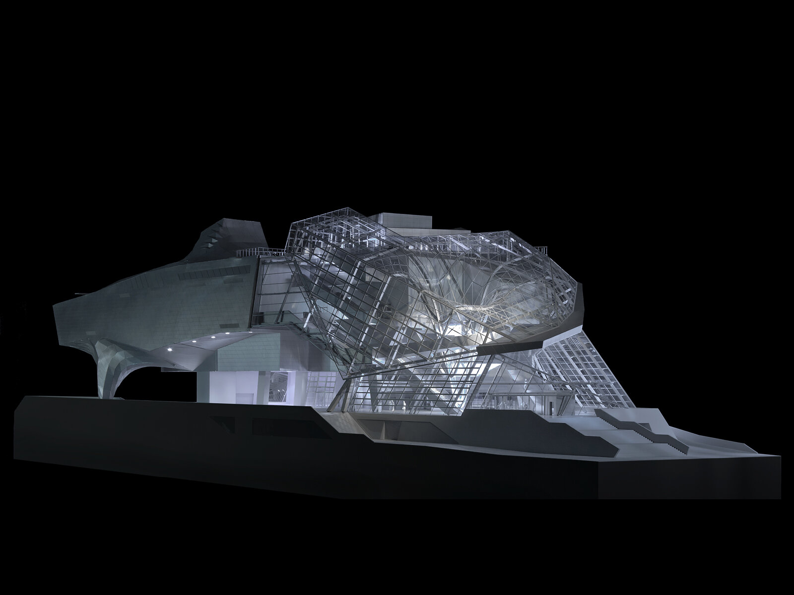
Lyon’s Presqu’île, the peninsula where the Rhône and Saône converge, is one of France’s great urban set pieces, a place where the city meets its rivers with the full weight of French civic ambition. The Musée des Confluences was designed to anchor the southern tip of that peninsula, a building for a natural history institution reinventing itself as a museum of knowledge, of science, anthropology, and the future. Coop Himmelb(l)au won the international competition in 2001 with a concept built on two complexly linked elements: the Crystal, a steel and glass entrance structure rising toward the city, and the Cloud, a stainless steel mass floating above it on three major concrete piers, containing the exhibition halls within. The building was conceived to be traversable without a ticket, an open public space beneath, the museum elevated above the city rather than closing it off.
Wolf Prix ran a studio defined by energy, intensity, and a deliberate resistance to conventional elegance. The formal moves at Coop Himmelb(l)au were not in pursuit of refinement. They were in pursuit of authenticity, shapes generated by honest responses to site, program, and context, even when the result was uncomfortable, even when it looked, by conventional standards, wrong. The awkwardness was intentional. That intentionality was the point. What could appear ungainly to an outside eye was, within the studio, understood as integrity: form that had earned its strangeness by responding to something real.
Tom Wiscombe, whose design had won the competition, invited me to come to Vienna during the summer of 2002 to work on the museum with him. I had taken a year from graduate school to work in the office’s Mexico studio on another project, and that experience established both the working relationship and the method. The process was primarily physical. High-density foam shaped on a hot wire machine, tape and straight pins at small scale, hot glue and museum board and foam core as the models grew. The Crystal and the Cloud were worked through by hand, iteratively, form evaluated through touch and sight before it ever entered the computer. At a certain point the physical models were digitized, and the design moved between hand and screen, each informing the other. It was the same instinct that would define Gehry’s office years later, craft as the origin of form, technology as its continuation. Here I found it first.
Wolf Prix ran a studio defined by energy, intensity, and a deliberate resistance to conventional elegance. The formal moves at Coop Himmelb(l)au were not in pursuit of refinement. They were in pursuit of authenticity, shapes generated by honest responses to site, program, and context, even when the result was uncomfortable, even when it looked, by conventional standards, wrong. The awkwardness was intentional. That intentionality was the point. What could appear ungainly to an outside eye was, within the studio, understood as integrity: form that had earned its strangeness by responding to something real.
Tom Wiscombe, whose design had won the competition, invited me to come to Vienna during the summer of 2002 to work on the museum with him. I had taken a year from graduate school to work in the office’s Mexico studio on another project, and that experience established both the working relationship and the method. The process was primarily physical. High-density foam shaped on a hot wire machine, tape and straight pins at small scale, hot glue and museum board and foam core as the models grew. The Crystal and the Cloud were worked through by hand, iteratively, form evaluated through touch and sight before it ever entered the computer. At a certain point the physical models were digitized, and the design moved between hand and screen, each informing the other. It was the same instinct that would define Gehry’s office years later, craft as the origin of form, technology as its continuation. Here I found it first.
16
TOM WISCOMBE ARCHITECTURE / EMERGENT
Los Angeles, 2000–2003
Tom Wiscombe was on my first-year graduate jury at SCI-Arc and saw my studio work. Afterward he asked what I was doing that summer, mentioned he was starting a practice, and invited me to join him. His first hire, we launched it together. That summer working in his studio was an education in a particular design philosophy: loosen the grip on precision, accelerate the thinking, get the idea out before the tool gets in the way. Models, drawings, whatever was fastest. The method was always in service of the concept, never the other way around. That reordering of priorities permanently altered how I approach design. We stayed in touch through school, crossing paths again at Prix’s office where Tom was doing freelance work between semesters. By graduation, the relationship had its own momentum. He had won PS1/MoMA. The invitation to come build it was where the practice became real.
TOM WISCOMBE ARCHITECTURE / EMERGENT
P.S.1/MoMA
Summer Event Space
Summer Event Space
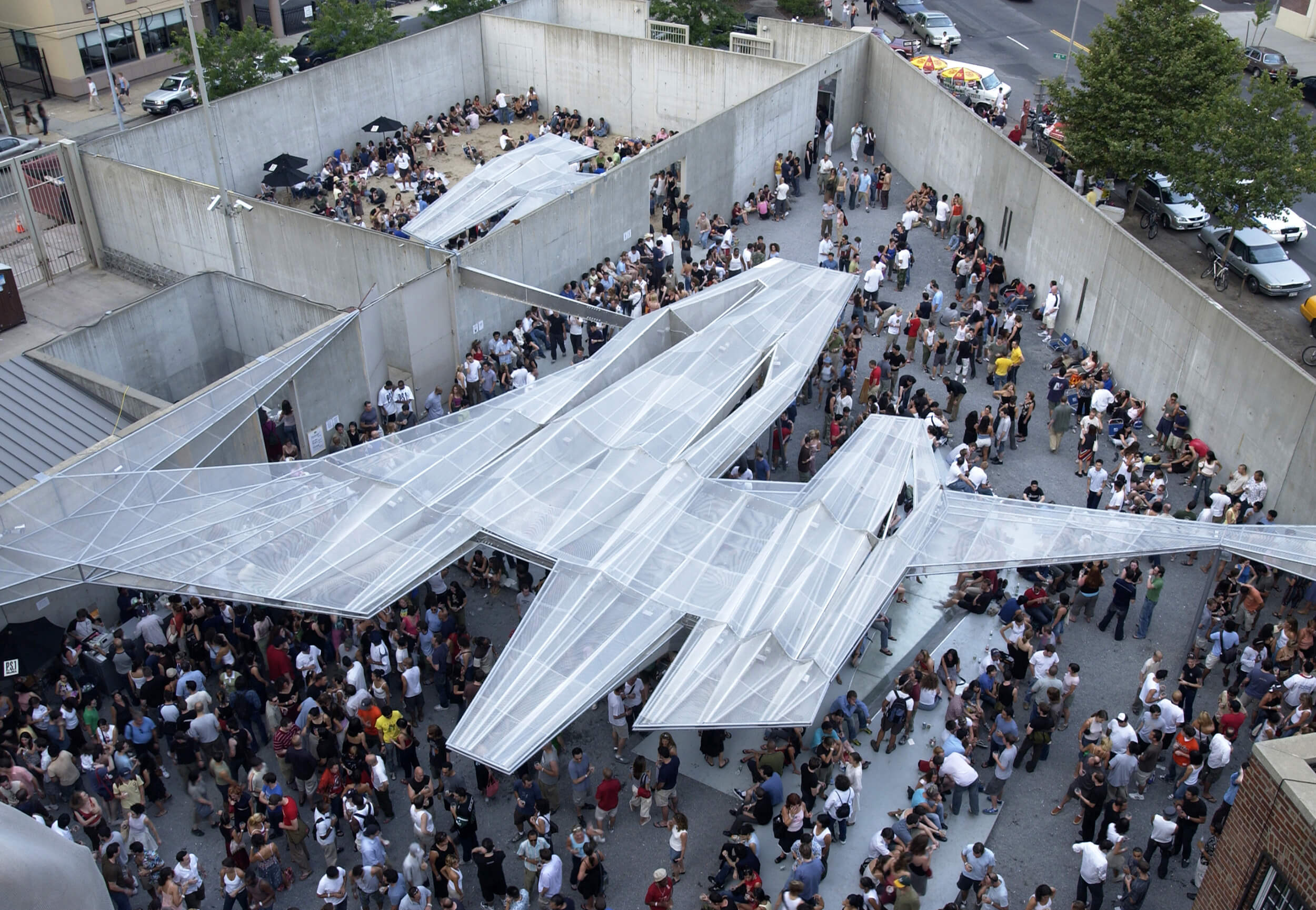
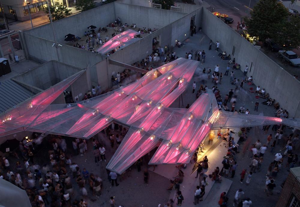
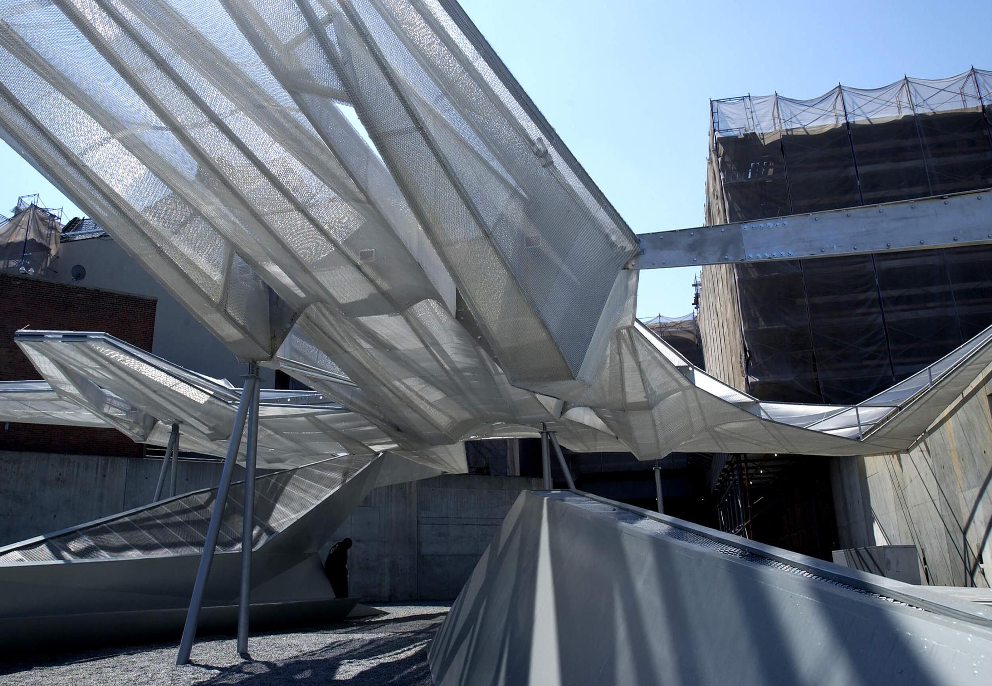
The Young Architects Program is one of architecture’s most compressed tests: a courtyard at MoMA PS1 in Queens, a brief requiring shade, seating, and water, a budget of $60,000, and two to three months from selection to opening. Tom Wiscombe won the 2003 competition with Light-Wing, a design built on two interlocked systems: a cellular canopy of interconnected canoe-shaped aluminum modules, translucent and permeable, functioning as shade by day and lighting by night, set above a leisure landscape of pools and promenades below. The canopy’s structural logic rejected conventional hierarchy, each cell determining its geometry through local shading requirements and the behavior of its neighbors, a non-hierarchical patterning that distributed load across the whole rather than concentrating it in any single element.
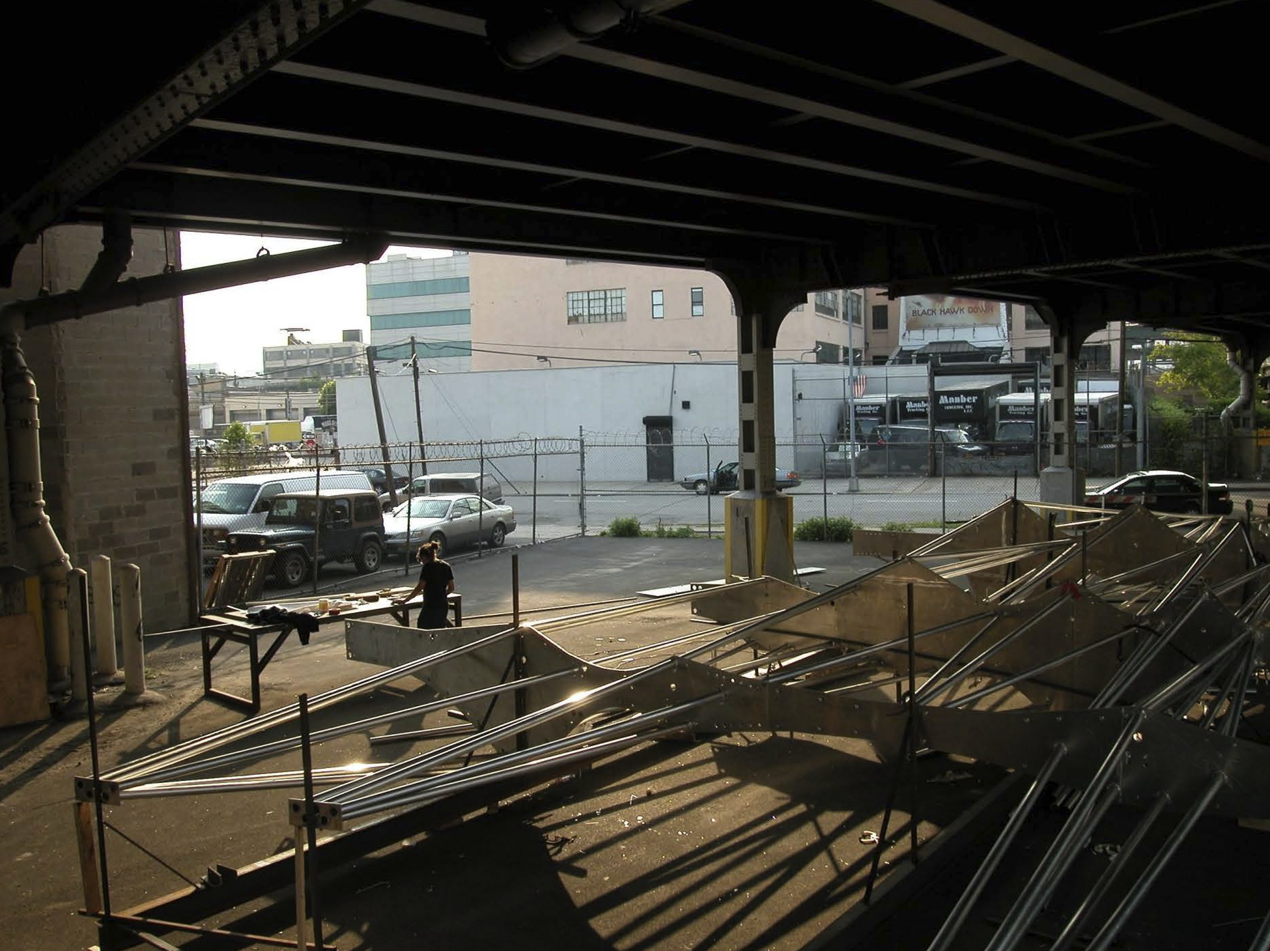
Tom asked me to come to New York to lead the construction. I had just finished my graduate thesis at SCI-Arc and graduated in April. The installation was due in summer. Fifty thousand of the sixty went directly to New Amsterdam Metals, a precision machinist operation with the skill to weld aluminum tube to aluminum plate, a technically demanding process given aluminum’s suppleness and the minimal tolerance for error at that scale. The remaining ten thousand covered everything else: a team of roughly a dozen students and interns recruited by Tom, working for intern wages, moving to Brooklyn for the summer to build it out. The canopy was fabricated in sections beneath the Brooklyn-Queens Expressway, in the open lot outside New Amsterdam’s studio, then wheeled down the street to PS1 and assembled on site. Yoko Ono had a project in the courtyard that was finishing its run as we arrived, and we installed as her piece came down.
That velocity had been established the summer before, in Tom’s studio. The first day on the job I spent six hours building what I thought was a strong design model, worked fast, was proud of it. Tom came back in the afternoon, looked at it, and said, “Is that it?” Before I could respond he picked up a large pair of steel scissors he called bone cutters, took the model apart, dropped it in the trash, and started cutting museum board himself. Hot glue, tape, plexiglass, shapes emerging in minutes. “We have to work fast,” he said. “Ideas, as many as possible, as quickly as possible.” It was a short lesson. It changed everything.
What made this unusual, and what I remember most clearly, was how we built it. There were drawings, minimal ones, used primarily to pattern-cut the aluminum plate and establish the principal structural connections. Beyond that, the information lived in a 3D model. The architecture industry in 2003 was still organized around paper. There was no BIM, no established workflow for translating a digital model directly into fabrication. I was on site with a laptop, pulling geometry, translating dimensions in real time for the metalworkers. Building directly from a three-dimensional model, bypassing the drawing set entirely, was genuinely rare at that moment. It was also, looking back, a preview of everything that followed.
Tom asked me to come to New York to lead the construction. I had just finished my graduate thesis at SCI-Arc and graduated in April. The installation was due in summer. Fifty thousand of the sixty went directly to New Amsterdam Metals, a precision machinist operation with the skill to weld aluminum tube to aluminum plate, a technically demanding process given aluminum’s suppleness and the minimal tolerance for error at that scale. The remaining ten thousand covered everything else: a team of roughly a dozen students and interns recruited by Tom, working for intern wages, moving to Brooklyn for the summer to build it out. The canopy was fabricated in sections beneath the Brooklyn-Queens Expressway, in the open lot outside New Amsterdam’s studio, then wheeled down the street to PS1 and assembled on site. Yoko Ono had a project in the courtyard that was finishing its run as we arrived, and we installed as her piece came down.
That velocity had been established the summer before, in Tom’s studio. The first day on the job I spent six hours building what I thought was a strong design model, worked fast, was proud of it. Tom came back in the afternoon, looked at it, and said, “Is that it?” Before I could respond he picked up a large pair of steel scissors he called bone cutters, took the model apart, dropped it in the trash, and started cutting museum board himself. Hot glue, tape, plexiglass, shapes emerging in minutes. “We have to work fast,” he said. “Ideas, as many as possible, as quickly as possible.” It was a short lesson. It changed everything.
What made this unusual, and what I remember most clearly, was how we built it. There were drawings, minimal ones, used primarily to pattern-cut the aluminum plate and establish the principal structural connections. Beyond that, the information lived in a 3D model. The architecture industry in 2003 was still organized around paper. There was no BIM, no established workflow for translating a digital model directly into fabrication. I was on site with a laptop, pulling geometry, translating dimensions in real time for the metalworkers. Building directly from a three-dimensional model, bypassing the drawing set entirely, was genuinely rare at that moment. It was also, looking back, a preview of everything that followed.
18
MICHAEL SIMS
Founder and Design Director · SimLabs LLC
786.726.3834
msims@michaelsimslab.com
michaelsimslab.com
Miami Tower · 100 SE 2nd Street, Suite 3214
Miami, FL 33131
msims@michaelsimslab.com
michaelsimslab.com
Miami Tower · 100 SE 2nd Street, Suite 3214
Miami, FL 33131
19